Building shared design practices for complex financial workflows
I joined a B2B banking platform where teams worked with inconsistent patterns and documentation, making complex flows difficult to follow. A merger of three related products amplified these existing gaps, as more people inherited unfamiliar features.
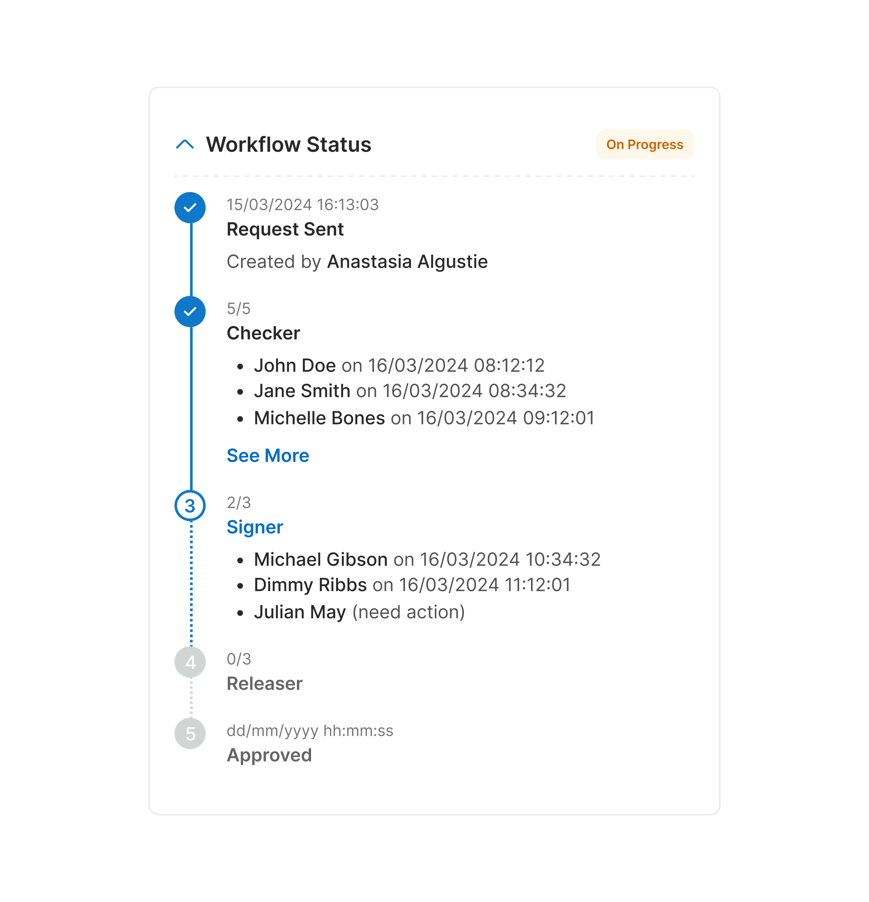
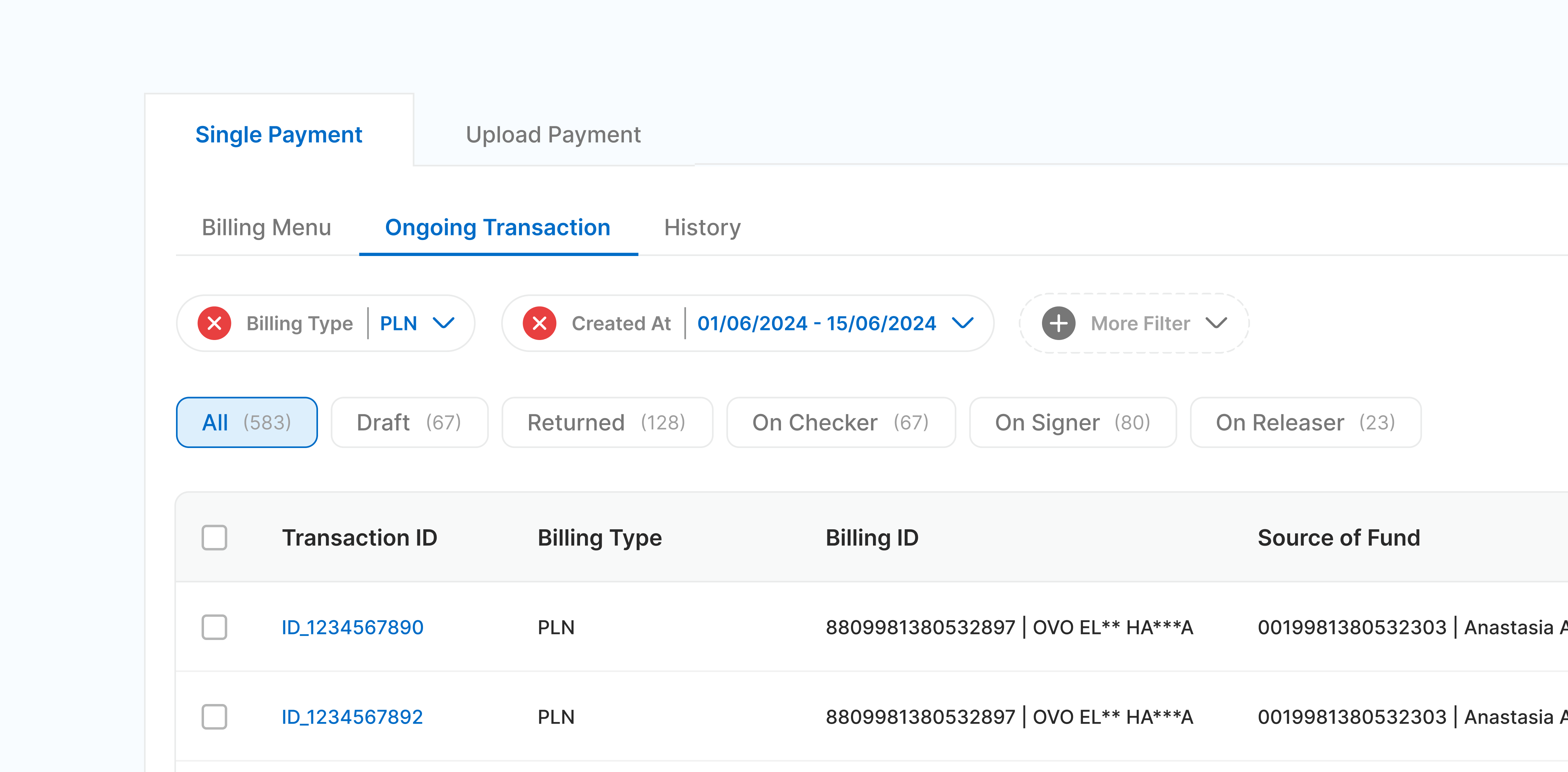
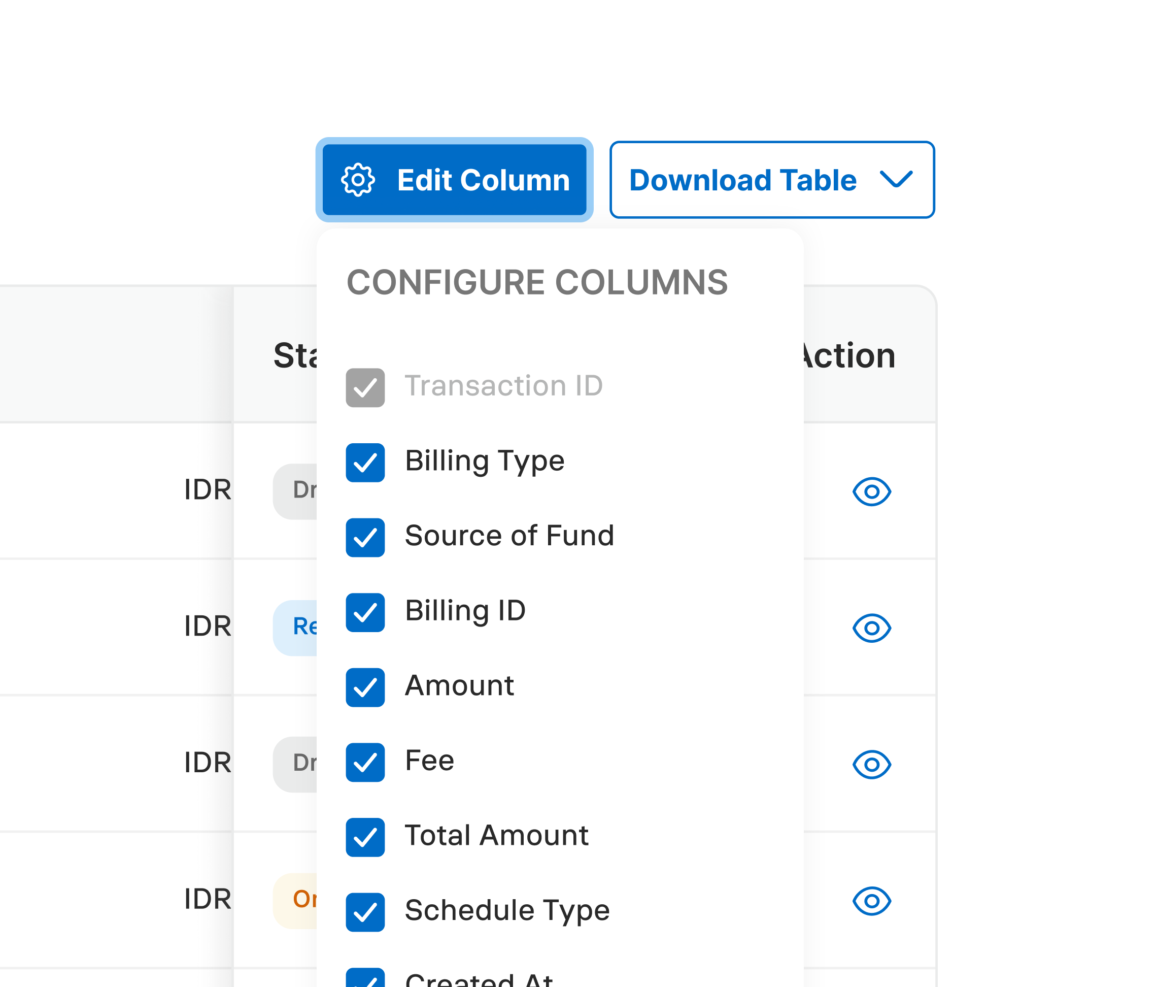
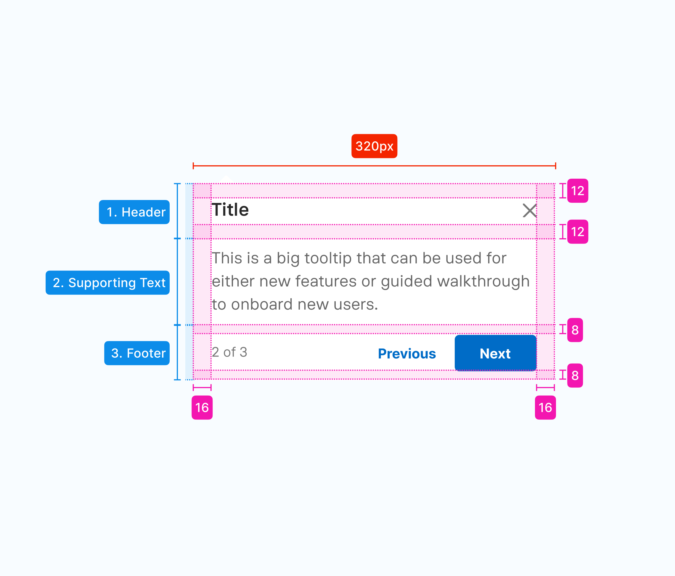
I contributed to the design system, helped designers align on patterns, and introduced a clearer handoff and documentation approach that enabled designers, POs, and developers to navigate complex financial flows.
- 10 plus designers adopted the shared working practices
- 26 plus features adopted the new handoff arrangement
- around 700 design components aligned and shipped
This case study has been anonymized for confidentiality.
Alignment depended heavily on each feature team, leading to numerous inconsistencies across features
Multiple Product Owners and development squads managed their own features, while designers worked across several teams. Over time, each team developed different ways of documenting requirements, applying patterns, and preparing designs for development.
Shared patterns applied differently
A design system was available, but similar components could still behave differently across features. Evolving requirements and squad-level decisions gradually introduced more and more variations.
Handoff completeness varied
Each designer documented their work differently. Missing flows and edge cases were often discovered through follow-up questions during development.
Decisions scattered across conversations
Requirements and changes were commonly discussed through meetings and chat. Designers helped translate those discussions into flows and screens. With limited written documentation, the reasoning behind the final design was difficult to trace later.
Priorities could change quickly
Many initiatives followed directions from upper management and moved through several layers of approval. New directions could change an approved design directly while development was already progressing.
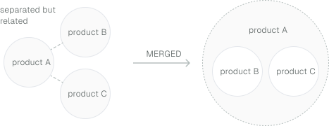
3 products merged into 1, amplifying the existing gaps
The company later merged three related financial products into one platform. Each brought its own teams, workflows, and patterns shaped around different customer segments. As the products and teams came together, people increasingly handled unfamiliar features.
Unfamiliar features, limited context
Financial features already involved multiple roles, approval levels, system processes, and edge cases. When ownership changed, the next person needed to understand complex banking flows, but decision history was difficult to trace.
Rebrand still evolving
The merger ran in parallel with the company's ongoing rebranding, and the guidelines were still taking shape for an extended period. Design had to ship on the same timeline, with visual guidelines still evolving.
In a constantly changing, complex setting, how might we improve clarity and alignment?
Building foundation we can maintain
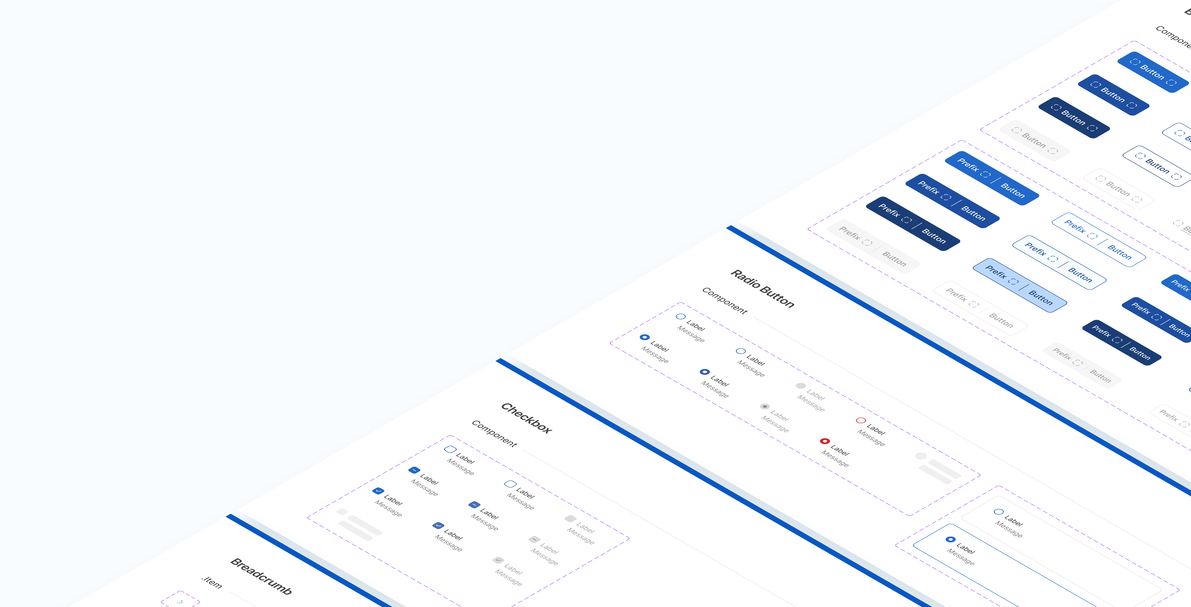
With no full-time design system team, I took ownership along with a few designers to build and maintain it alongside our feature responsibilities. For us, the biggest goal was adoption and standardization, with adaptability to continue evolving as the brand direction changed.
Instead of building everything from scratch, we agreed to use existing foundations and components as the base.
To keep it manageable, we agreed on a few working principles:Create a local component for feature-specific needs.Move it into the design system when at least two features need it.Notify other designers when a shared component is added or updated.Prioritize patterns required by active features.Atomic tokenization for brand adaptability with variable mode.
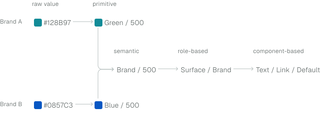
- Clear criteria for local and DS components
- Adaptable brand with design token
Aligning patterns through shared references
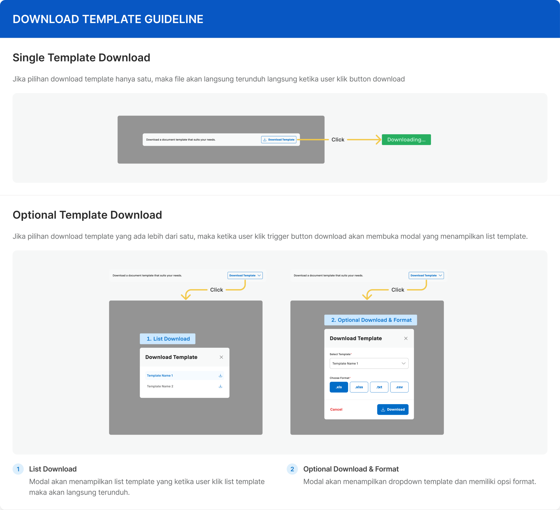
Alongside feature delivery, we refined shared components and documented their usage so designers had a clearer reference across features.
Improve the existing components
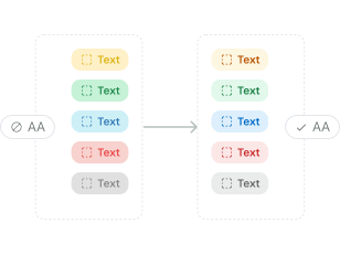
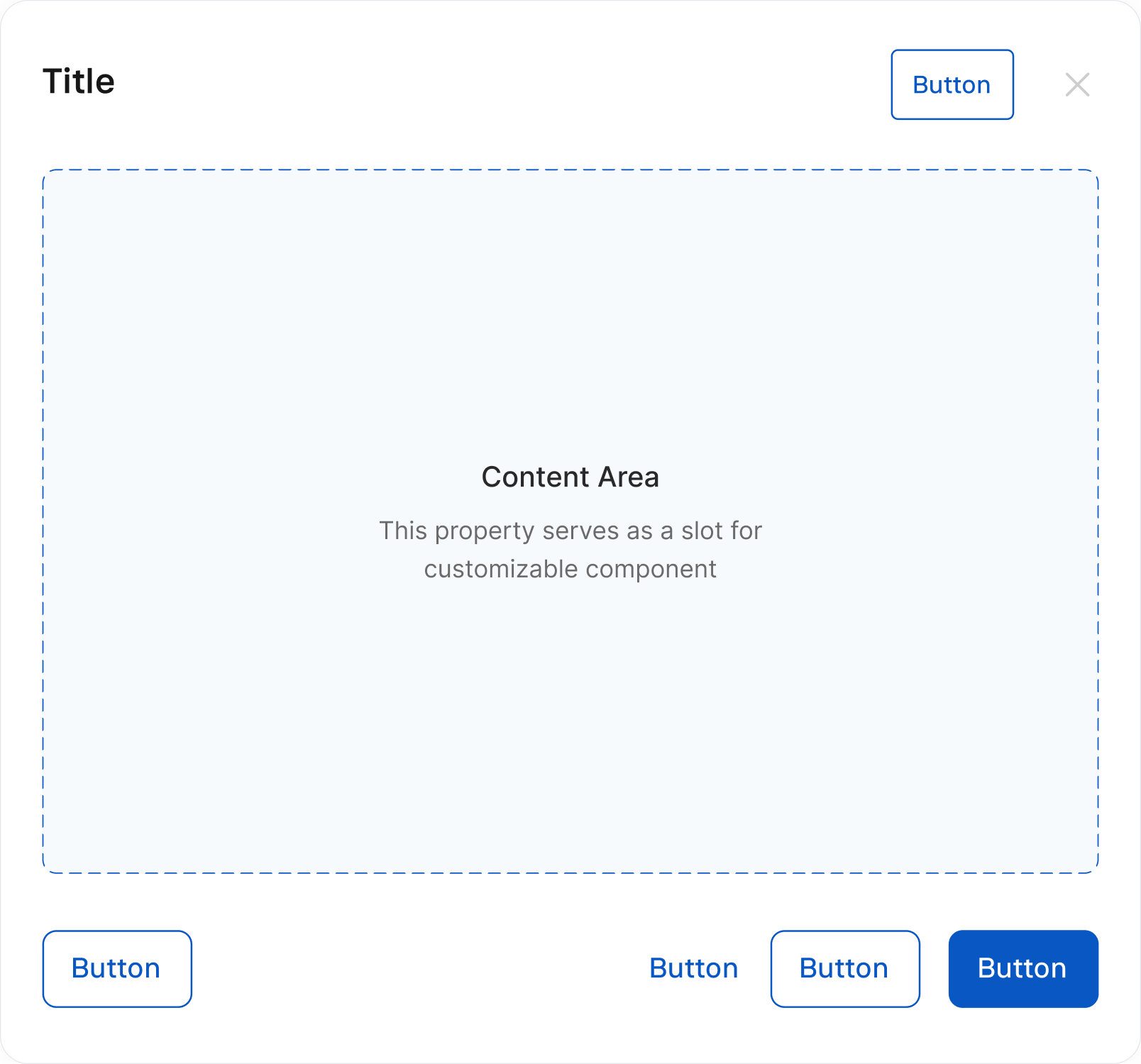
We reviewed components used in active features and adjusted patterns that created usability or consistency issues. This included improving accessibility and introducing flexible slots to support different feature needs while keeping the base component consistent.
Weekly decisions alignment
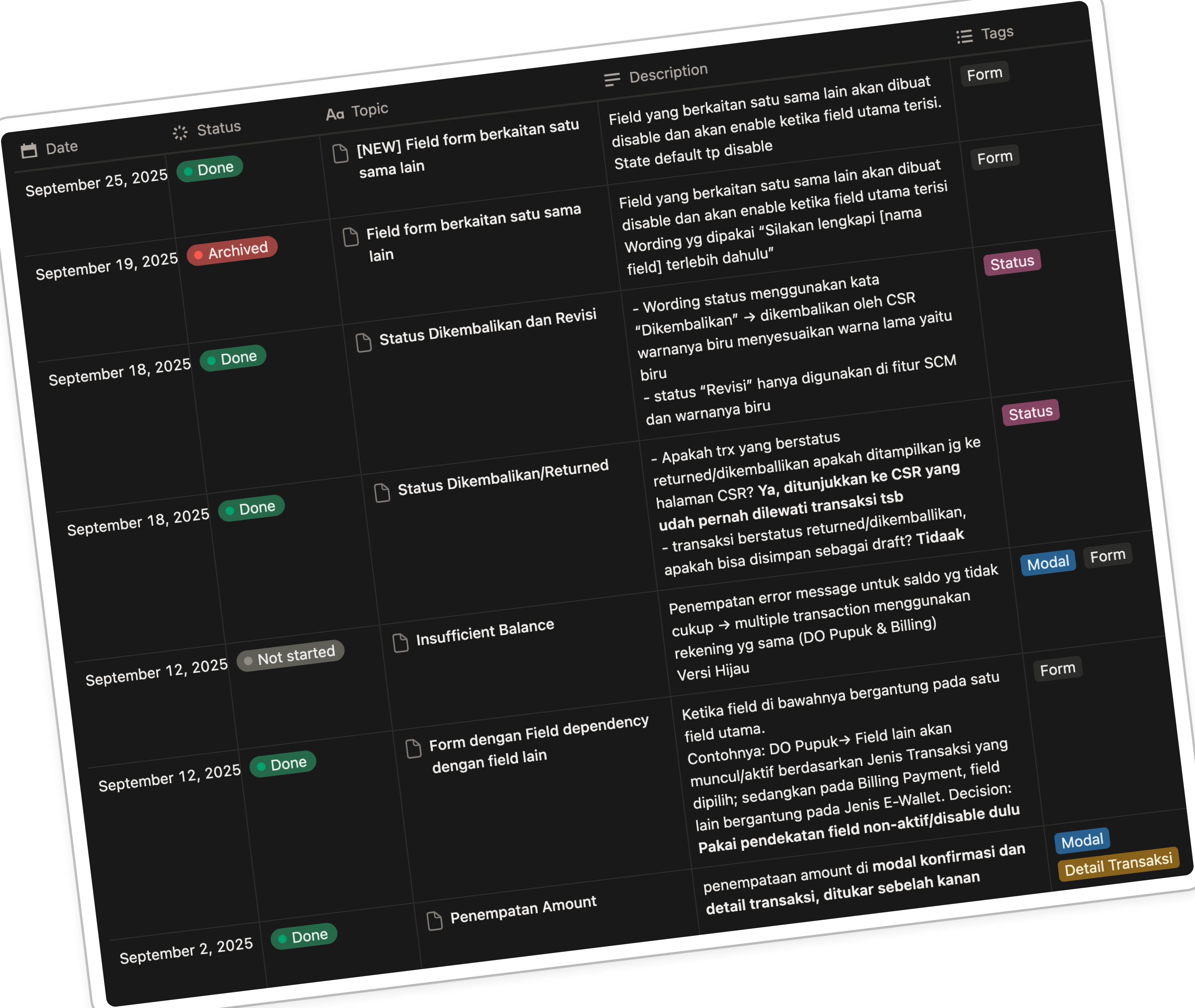
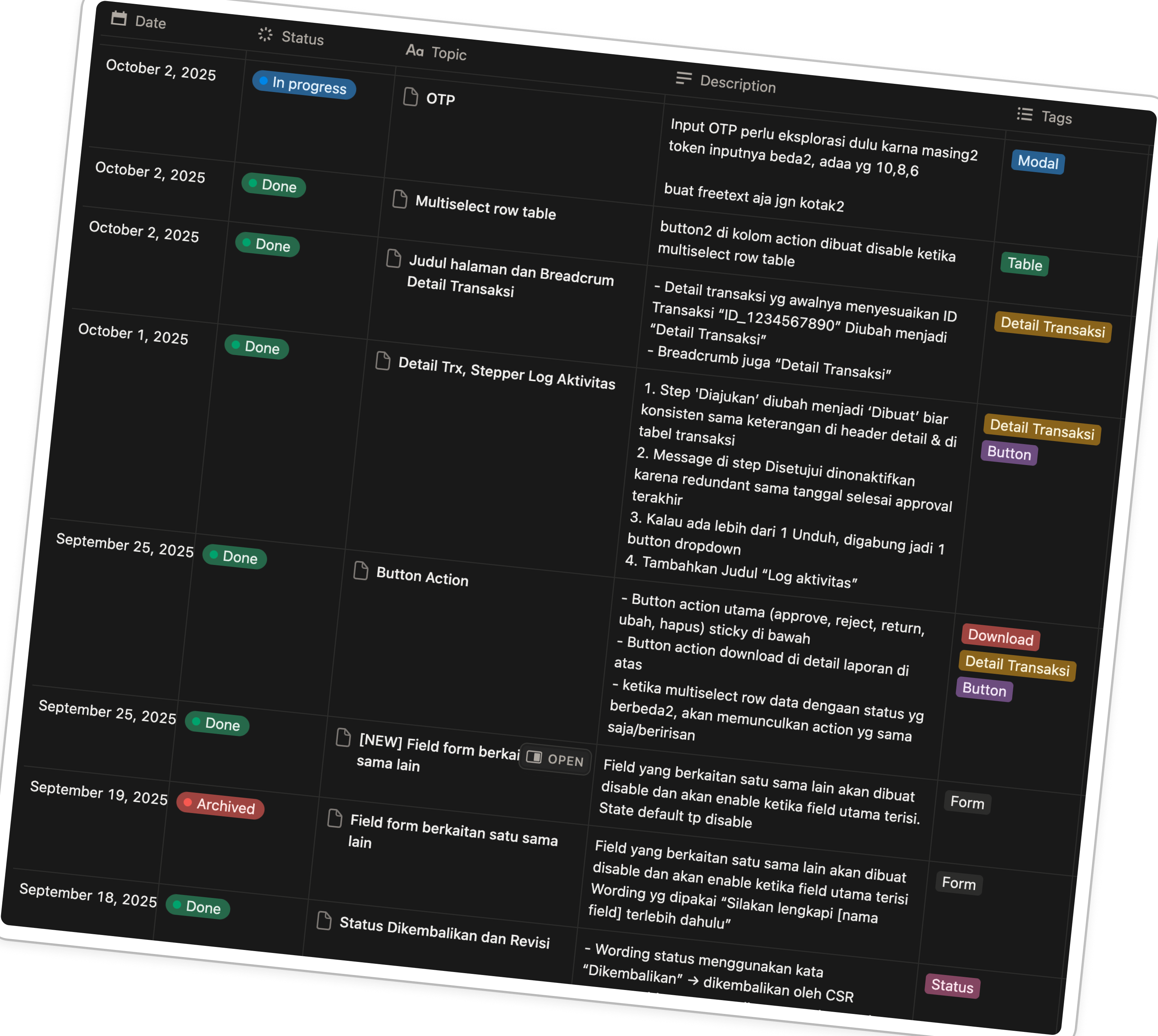
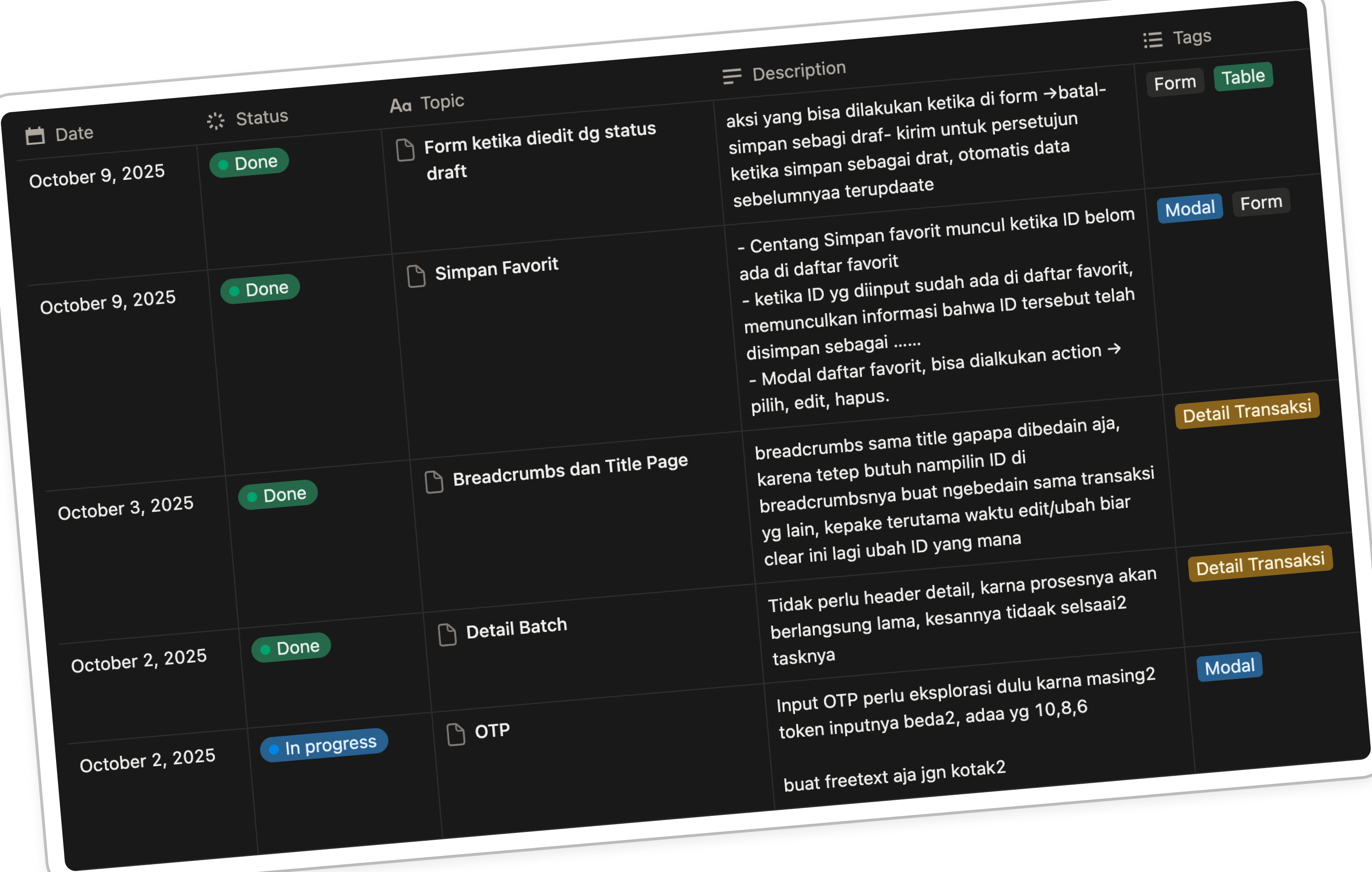
With feature backlogs still moving, we could not standardize every pattern at once. We created a weekly design sync to review the inconsistencies. With many patterns to align, I created a shared Notion tracker where designers could raise concerns and record weekly decisions.
Establish a shared reference
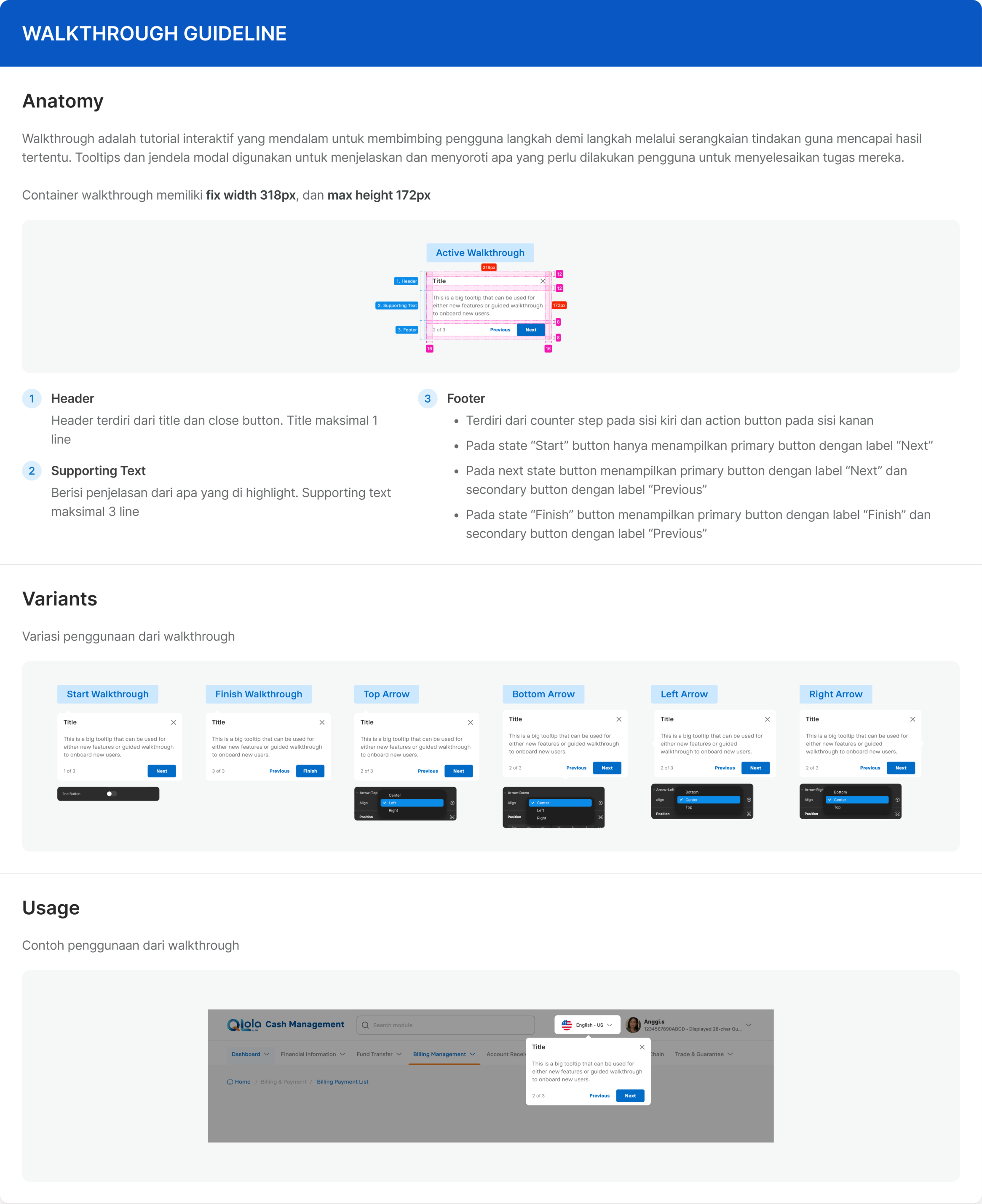
The agreed patterns were then brought into a design playbook. It became an early reference for designers during the merger, giving a common reference for component behavior and usage.
Keeping up with the change
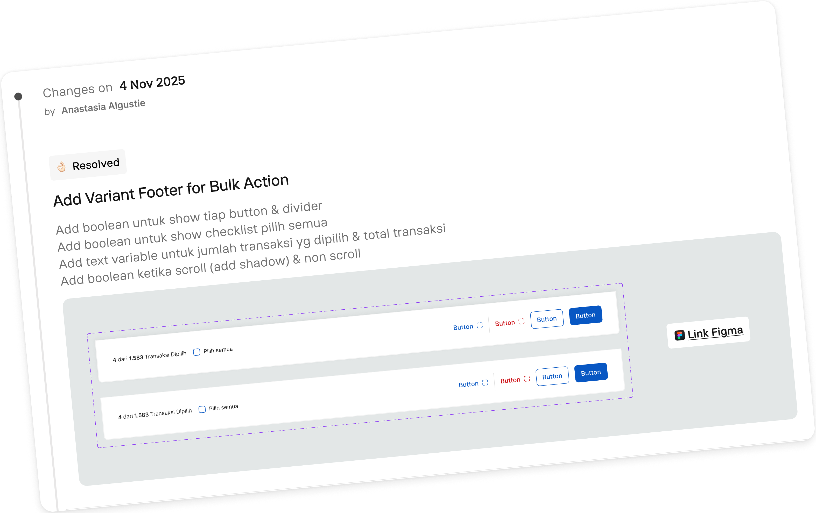
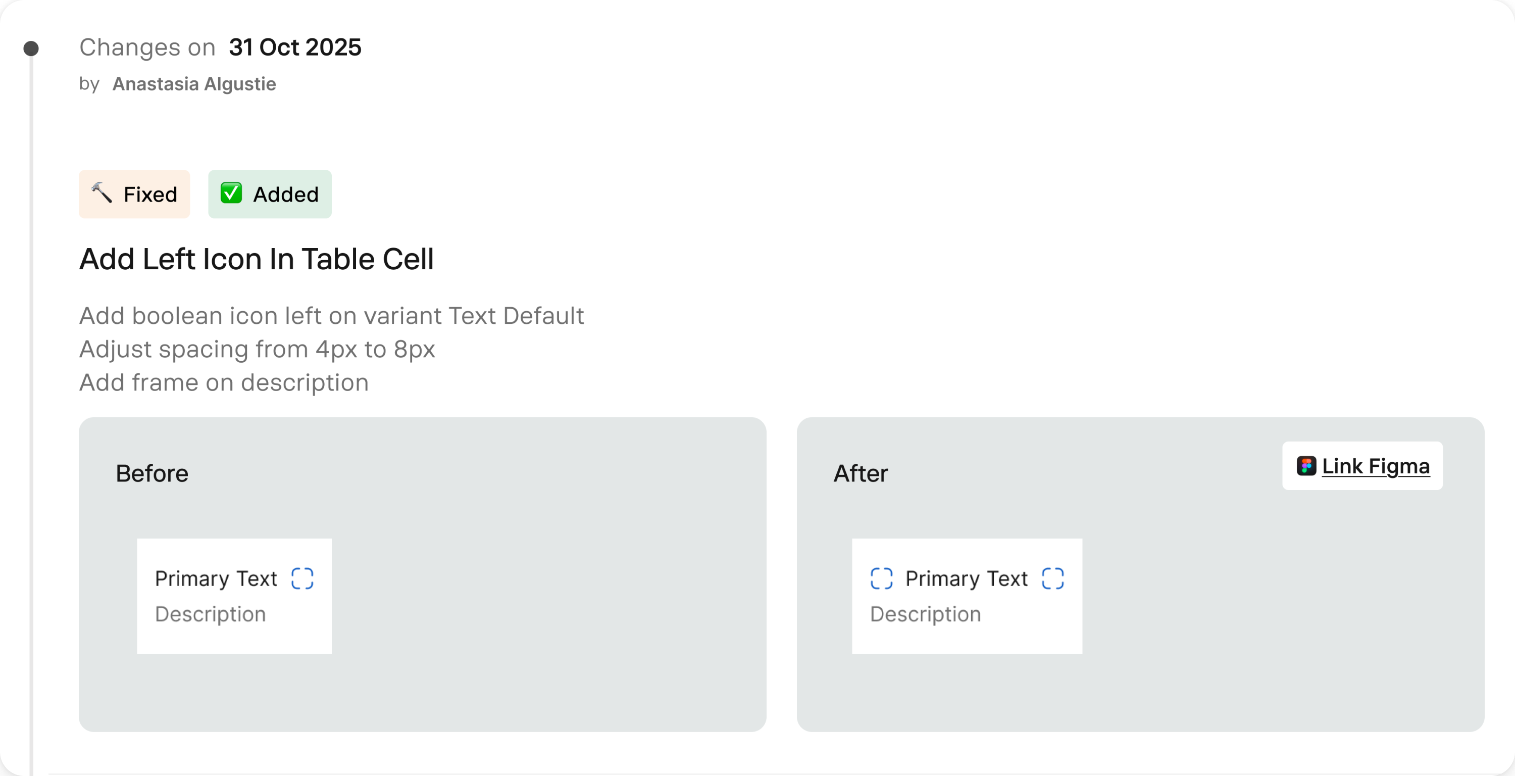
The team worked with one shared Figma account, making individual updates difficult to identify. I introduced a changelog in the design system file to record what changed, when, and who made the update.
- Shared guidance for component usage
- Better UX built in the system
- Flexible component with consistent base
- Traceable DS changes
Finding clearer ways to deliver complex UX flows
Complex financial features also needed a clearer way to communicate their end-to-end logic, especially for teammates unfamiliar with the feature. That led me to explore a more structured way of documenting UX flows.
Connecting logic with interface
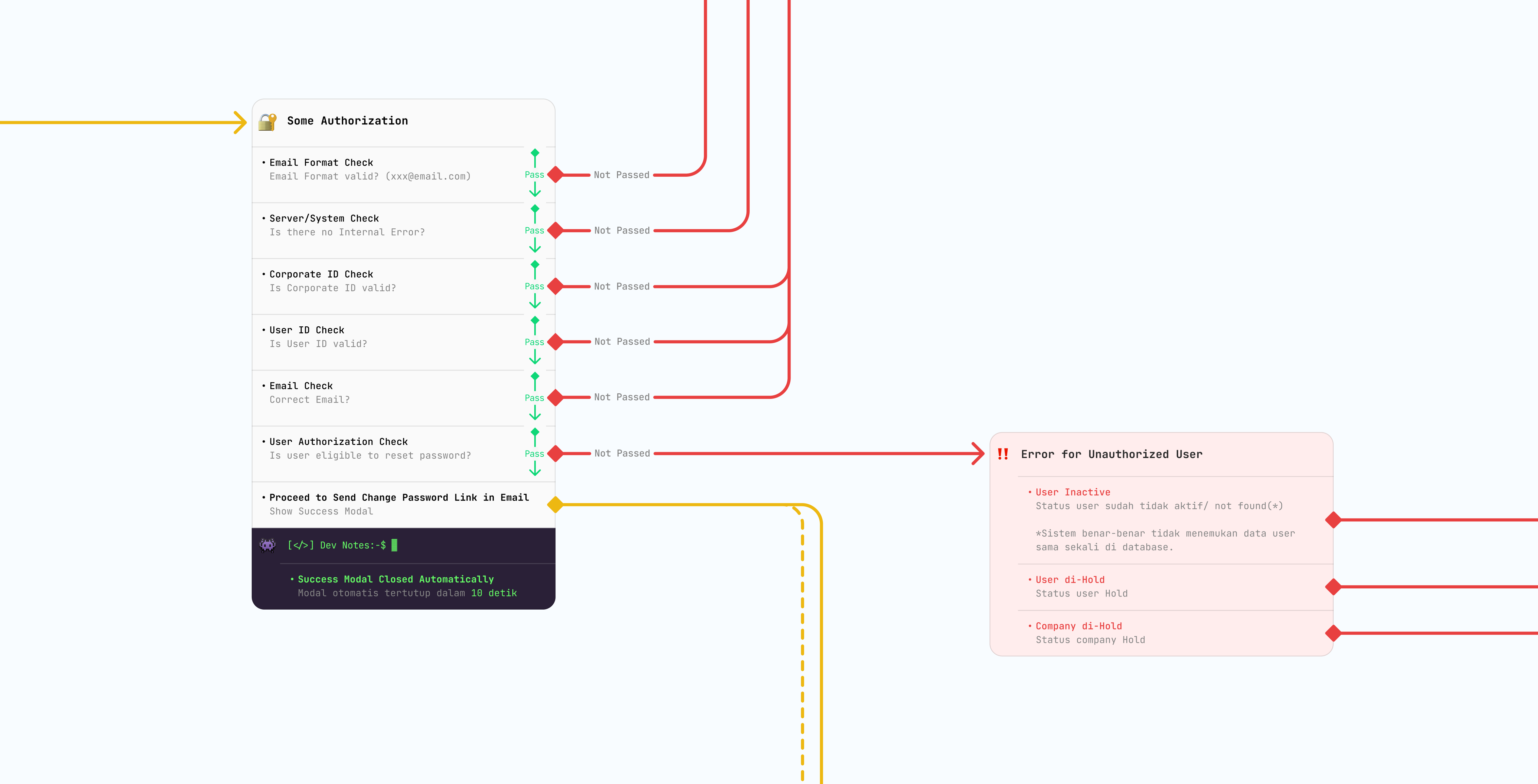
I discovered the Ninode by Nino Ngahamarat through an external article and webinar. Its visual structure connected user actions, screens, decisions, and system responses in one view. I saw an opportunity to adapt it for our complex financial workflows, starting with one of my features.

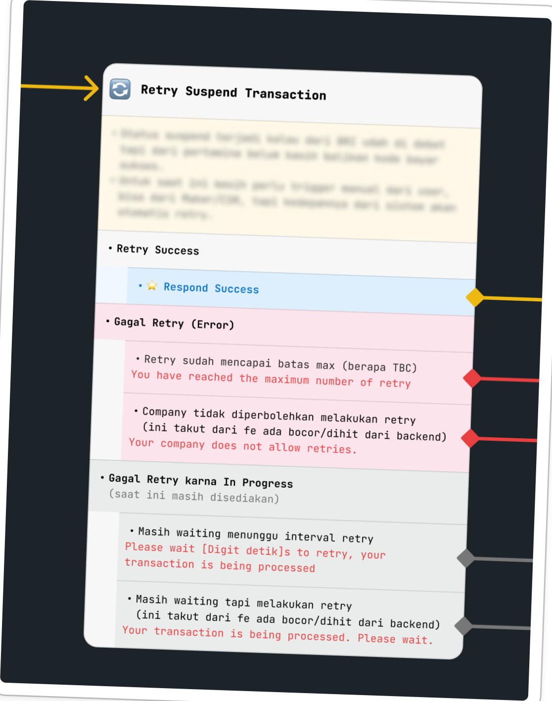
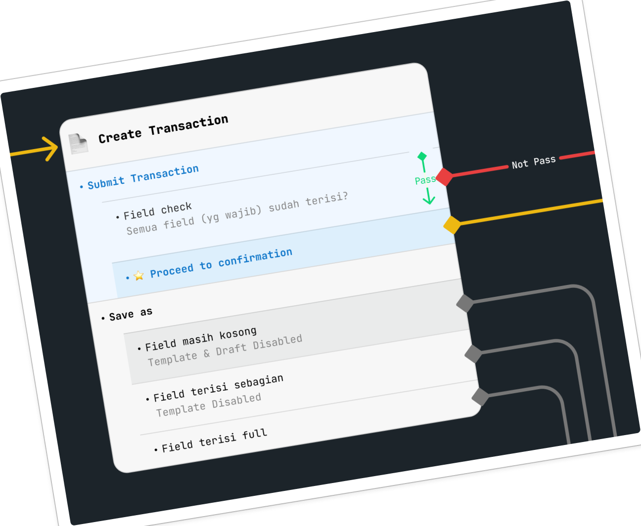
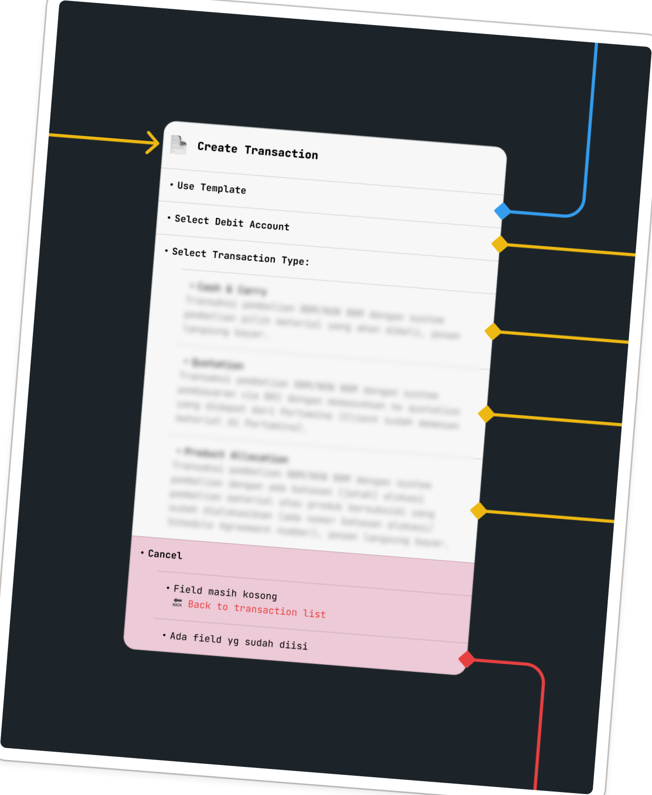
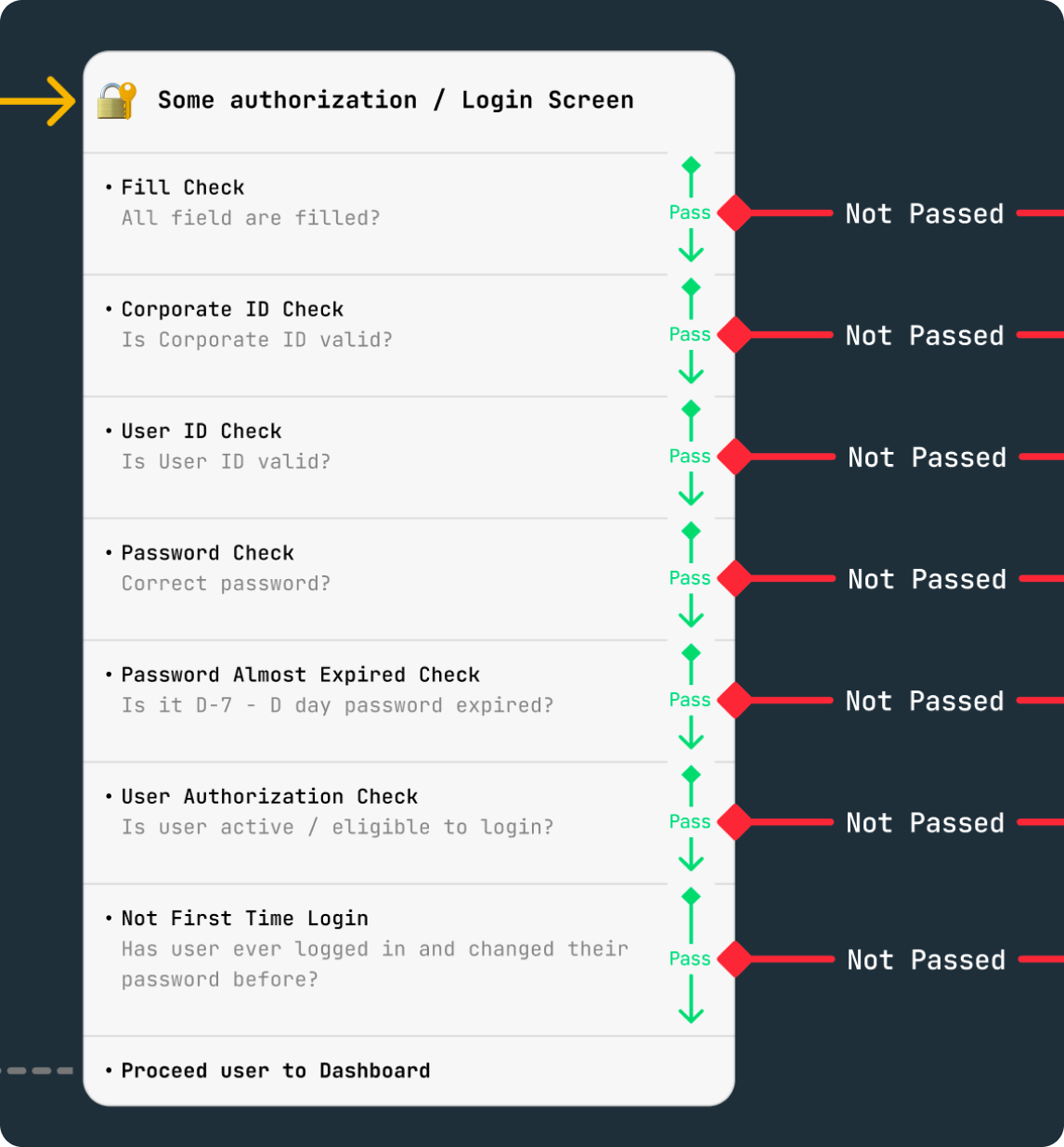
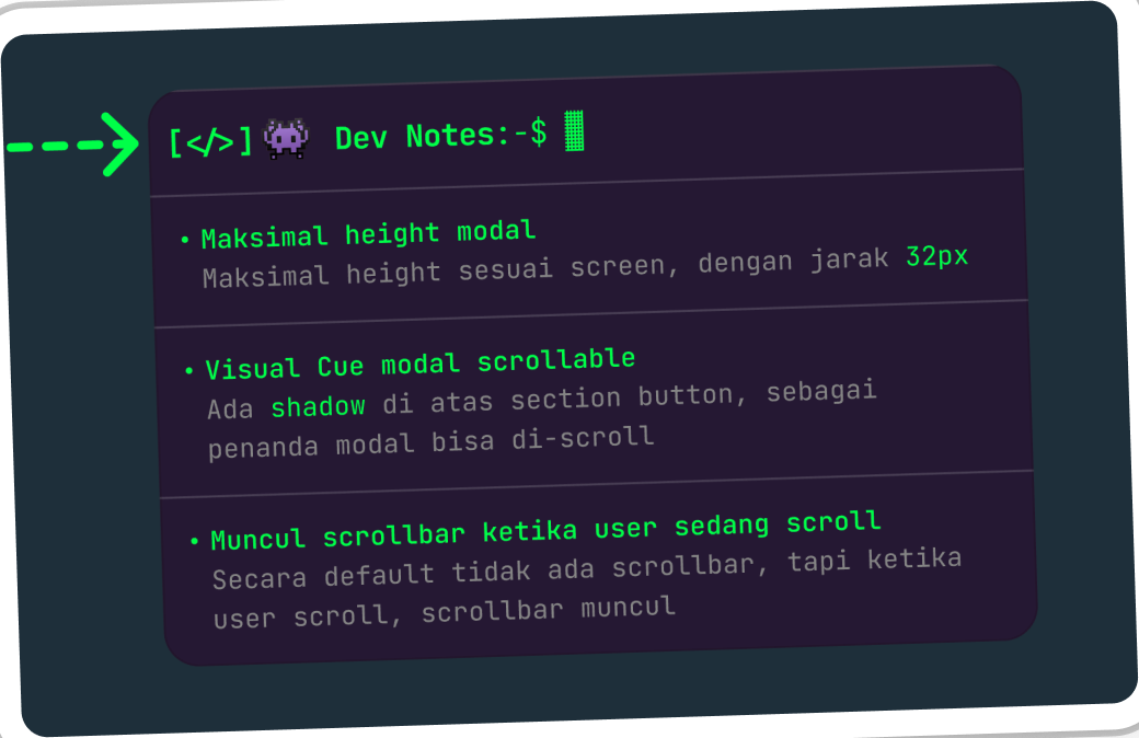
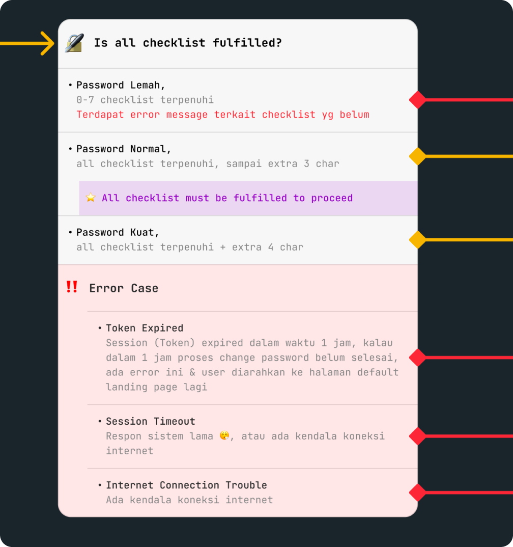
Using Ninode makes adding product contexts like logic, roles, terminology, workflow and dev notes easier to follow. The connected view also made missing scenarios easier to identify and gave engineers a clearer path through the feature. I walked the PO and developers through the new format and got positive responses.
Quote: This flow is easier to read! I prefer this format. By Product Owner. Product Owner
Quote: The new handoff is really comprehensive while keeping it concise and easy to understand. By Developer. Developer
Building support around a working example
After testing it through a real handoff, I shared the working example with a few designers before demonstrating the approach in a team meeting.
The new approach would require more preparation from designers. But looking at the future impact, we agreed that this additional effort was necessary. Other designers began adapting the structure and it became the new standard.
Reducing missed states
Using my detailed example, the practice grew into a design checklist covering common feature flow, including edge cases. This gave designers a common base for the definition of done and encouraged more complete handoffs.
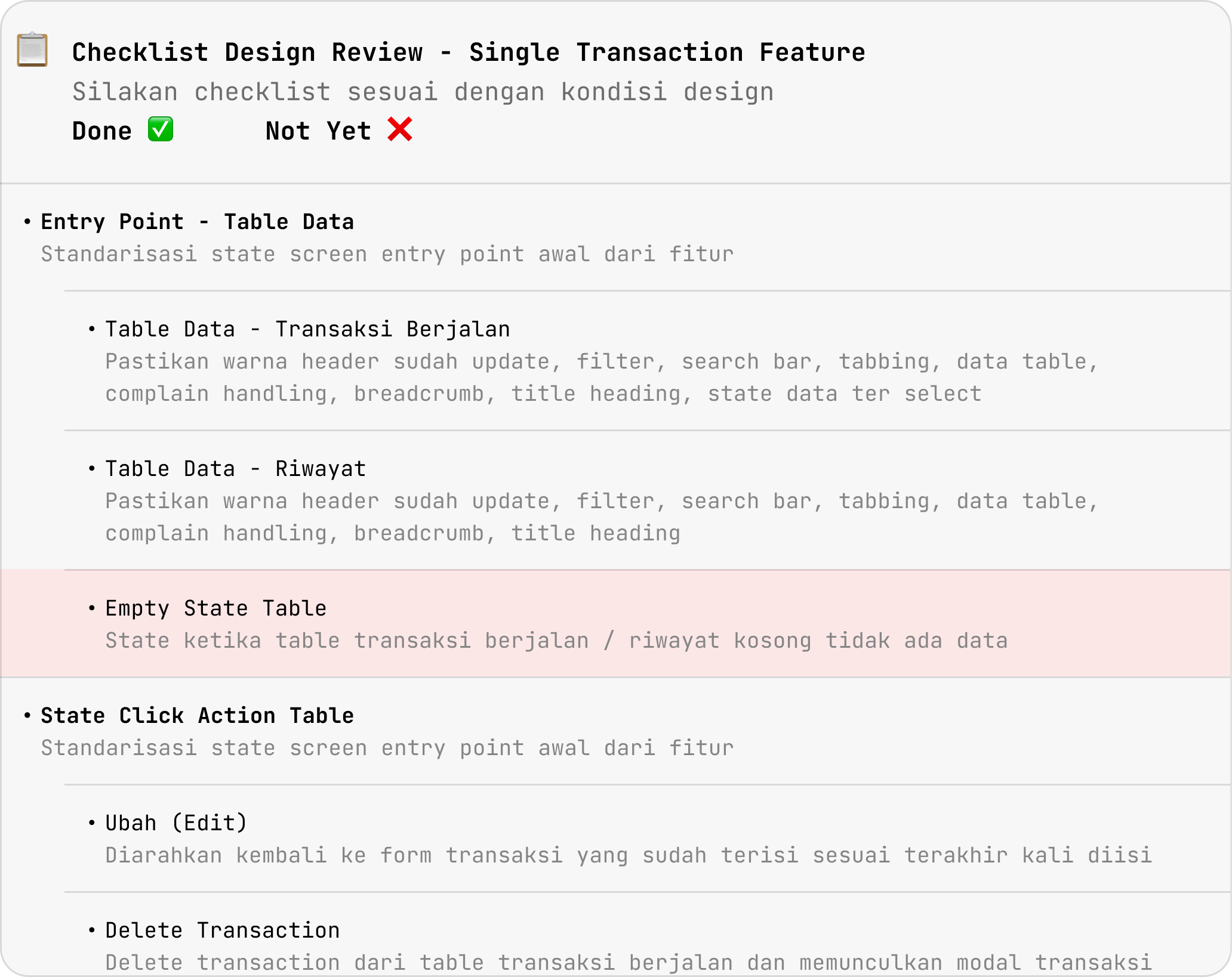
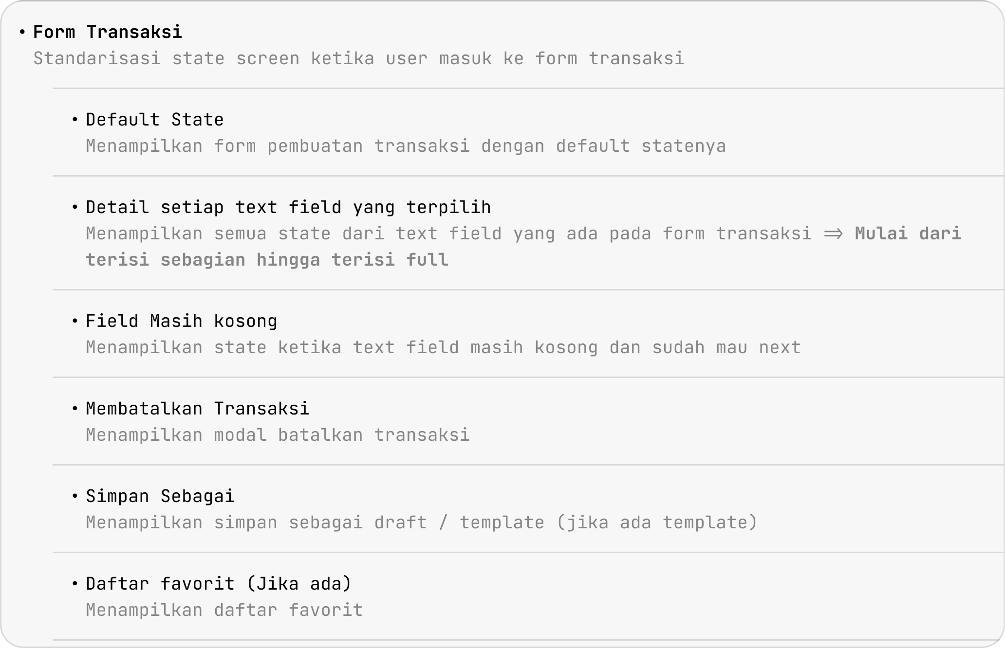
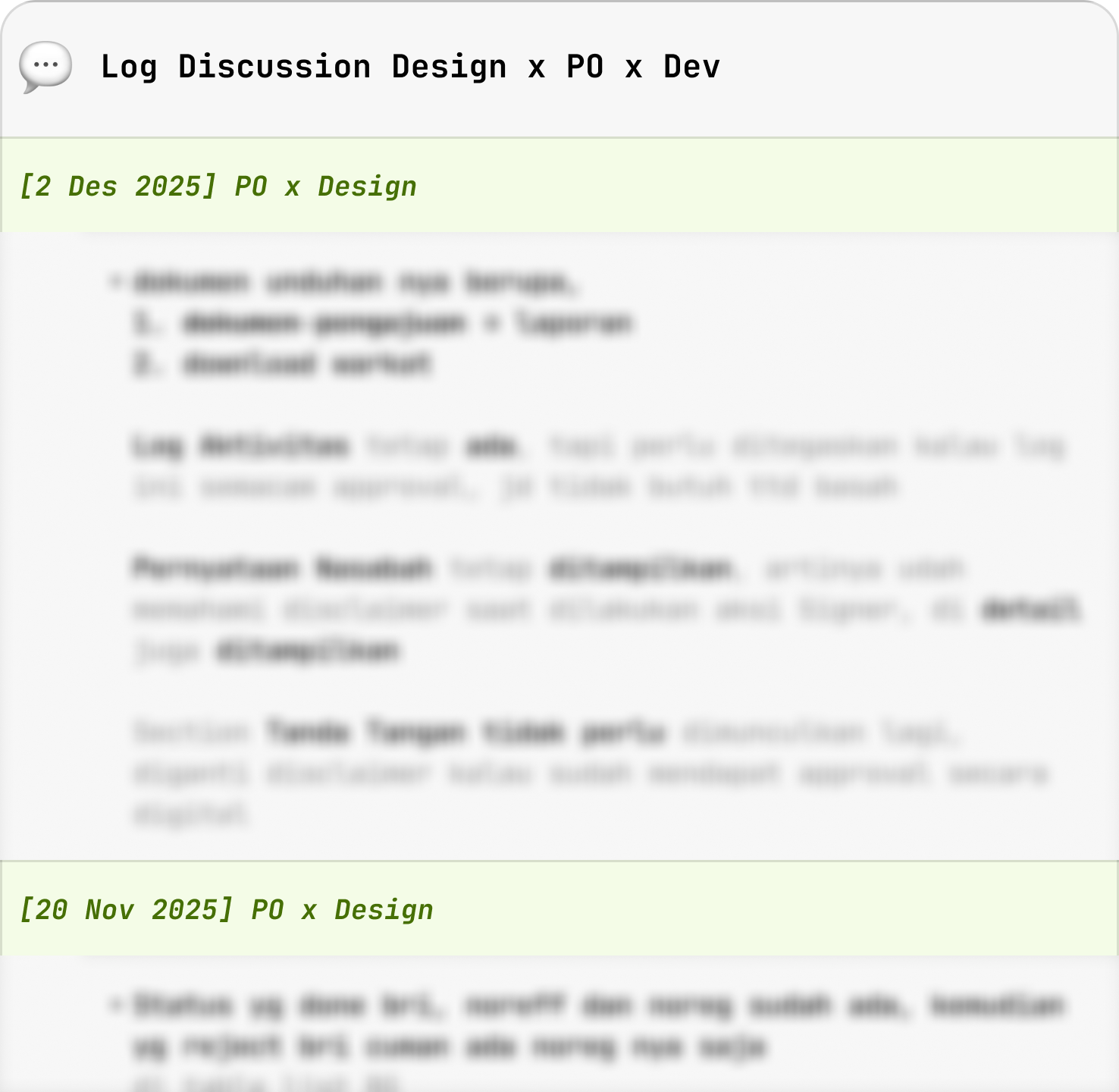
To make larger features easier to navigate, I added a table of contents linked to each flow and development status. Key discussions and decisions were also recorded alongside the designs, preserving context for future updates and handoffs.
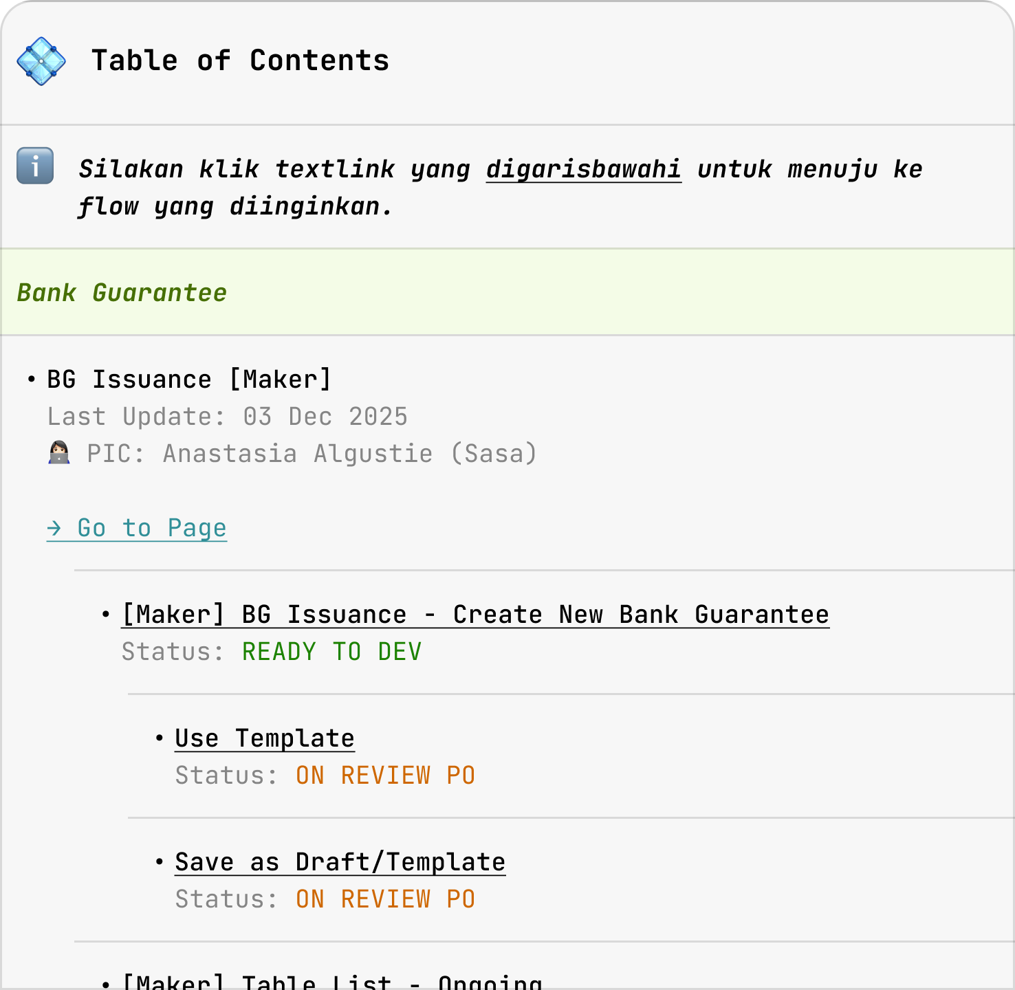
- More comprehensive design shipped
- Standardized handoff practice
- Fewer follow-up question on missing states upon handoff
What moved
A design system and workflow organization is never ‘done’ but we saw clear impacts:
- Clear criteria for local and DS components
- Adaptable brand with design token
- Shared guidance for component usage
- Better UX built in the system
- Flexible component with consistent base
- Traceable DS changes
- More comprehensive design shipped
- Standardized handoff practice
- Fewer follow-up question on missing states upon handoff
What started as an experiment within my own feature grew into a team-supported practice, reaching 10+ designers, 16 development squads, and 26+ feature areas.
Learnings
Along the way, I learned how much adoption depended on everyday conversations, clear ownership, and continued attention.
Progress means working with constraints
The environment was not perfect, and I could not change every part of the process. I learned to understand the constraints, stay adaptable, and improve the areas within my influence.
Practices need continued follow-through
Documentation alone wasn’t enough to drive adoption. The practice still needed people to advocate for it, revisit gaps, and maintain the references.
Alignment starts before the formal meeting
Smaller conversations helped me listen, refine the approach, and build support before wider discussions.
Credits to all designers, POs, developers, and all parties involved 🙌🏻