Boost product activation & value discovery across Bank Raya's multi-account savings experience
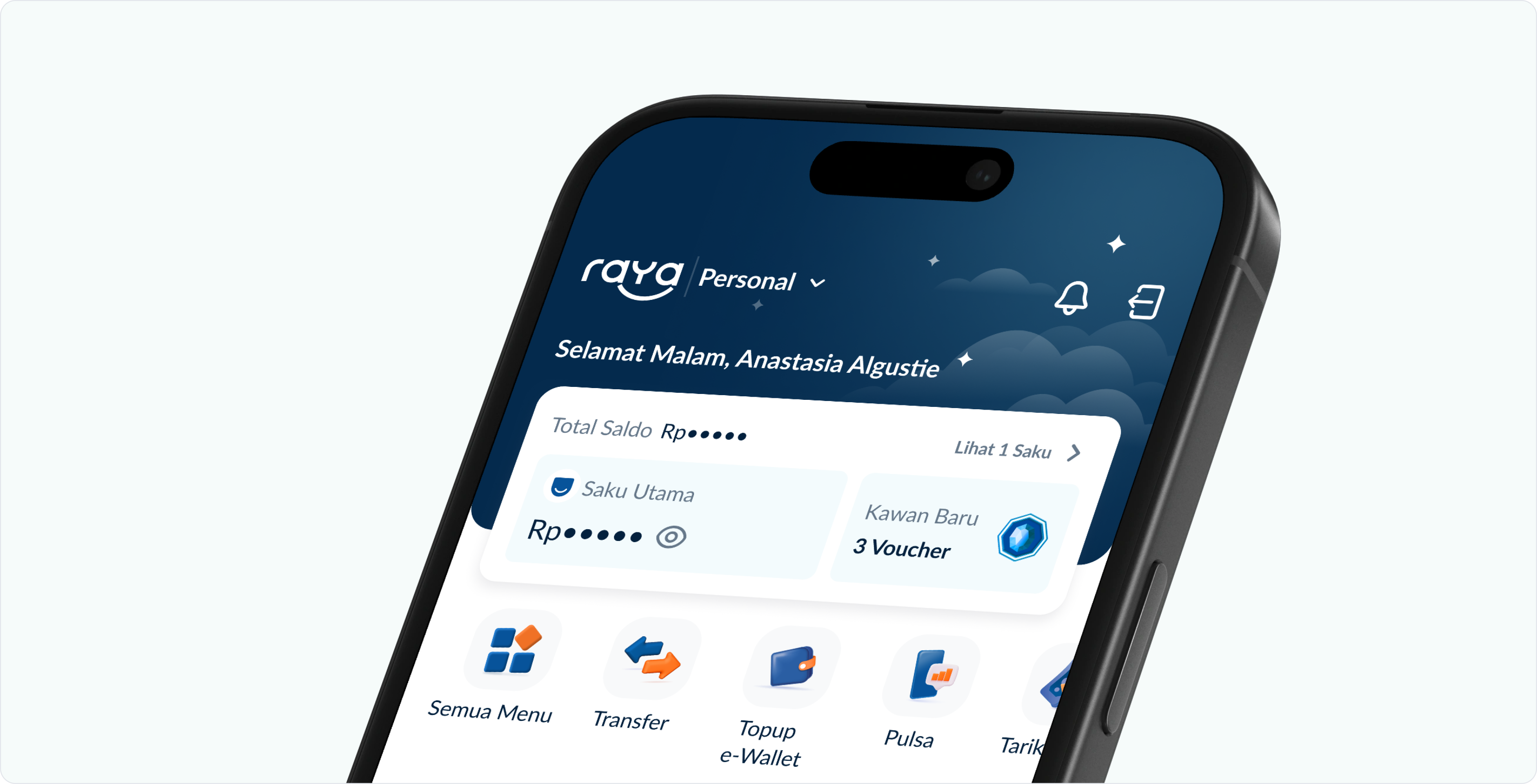
I led the Home and Saku (pocket account) Info pages revamp to address the struggle to convert new users into active ones and encourage the use of Saku for budgeting.
Both projects were initiated separately, but it became clear they were responses to the same underlying problem: users were not getting enough context to understand the product. I approached it as a connected system, designed to drive Saku adoption and deepen user engagement across the app.
I led the Home and Saku (pocket account) Info pages revamp to address the struggle to convert new users into active ones and encourage the use of Saku for budgeting.
Both projects were initiated separately, but it became clear they were responses to the same underlying problem: users were not getting enough context to understand the product. I approached it as a connected system, designed to drive Saku adoption and deepen user engagement across the app.

- around 25% Month on Month increase of top up conversion
- around 24% Month on Month increase of transaction conversion
- from 4 to 1 step to overview individual Saku balance
Bank Raya is an emerging digital bank in Indonesia, serving over 1M active users, aiming to cater to micro, SME businesses and gig-economy workers.
Users were dropping off after acquisition, leading to abandoned account and Saku
Quote: The current homepage is too plain, the stakeholder push us to redesign the homepage ASAP. By Product Manager. Product Manager
In 2022, the newly rebranded Bank Raya app (formerly BRI Agro) was still an MVP, intentionally minimal, with more features still in planning. The initial brief was simple: make the homepage "less empty" and more inviting.
At first, the initial brief was simple: make the homepage "less empty" and more inviting.
Quote: We have too many zero-balance user and Saku’s performance was low, we need to figure out how to improve. By Business & Savings PO. Business & Savings PO
Bank Raya features Saku (pocket), sub-accounts that let users split their money by purpose, each with its own account number. Despite becoming one of the top reasons users were drawn to the app (Product Market Fit 2022), 68% of active users had never created a Saku beyond the default one.
Then we saw another gap. Despite Saku (sub-accounts) becoming the top reasons users were drawn to the app, 68% of active users had never created more beyond the default one.
Users lacked the context to understand the product’s value
Through research, we found out the real issue was beyond the visual matters:
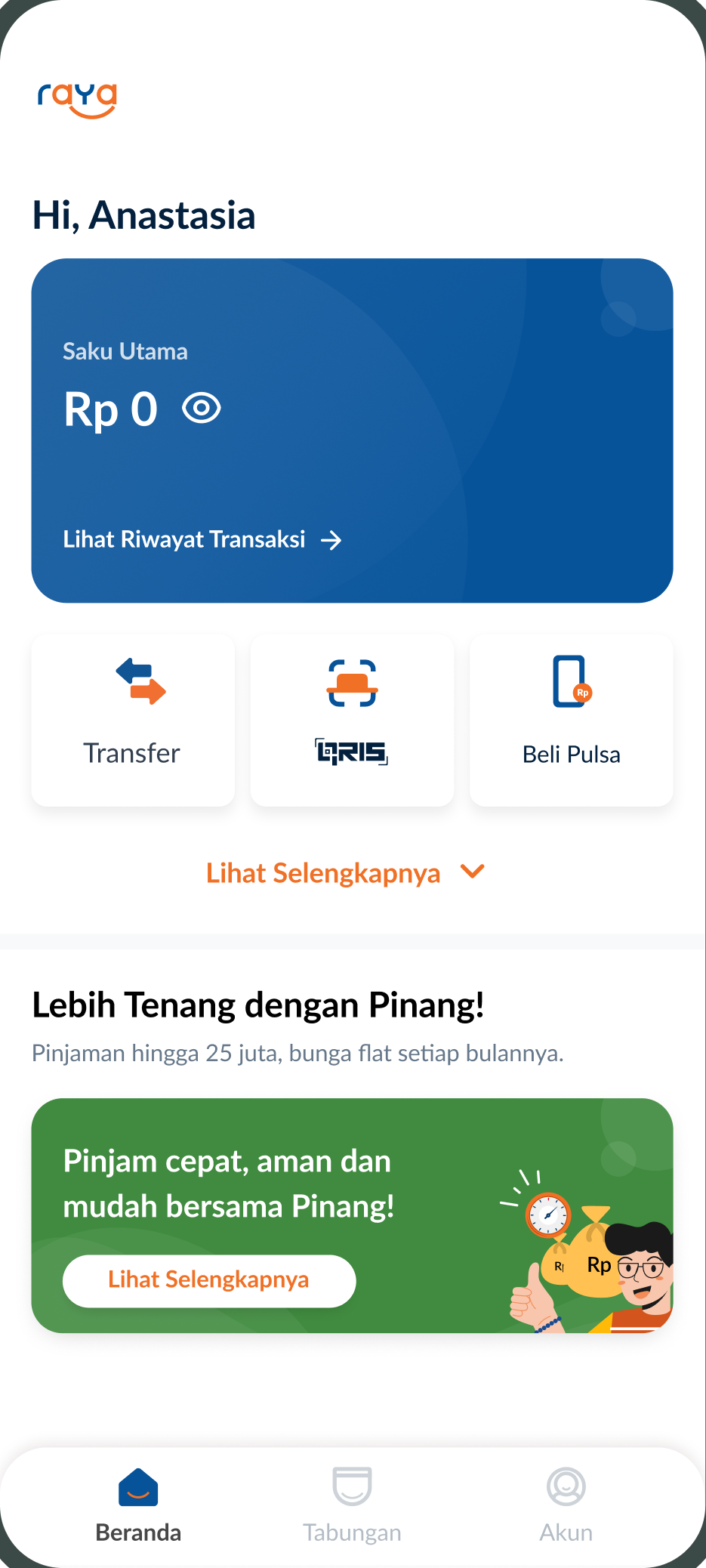
A quiet homescreen
New users landed with no clear next step and no sense of value. Migrated BRI Agro users, especially, panicked seeing a Rp0 balance at front. Not aware their previous balance is stored under the other Saku.
Quote: Why should I use Bank Raya? What’s in it for me?. By New User. New User
Quote: Why it shows 0 rupiah? Where’s my money?!. By Migrated User. Migrated User
The literacy gap
Indonesia's national financial literacy rate sits at ~50% (SNLIK 2022), and Bank Raya's target users skew toward those least familiar with digital banking.
Saku comprehension barrier
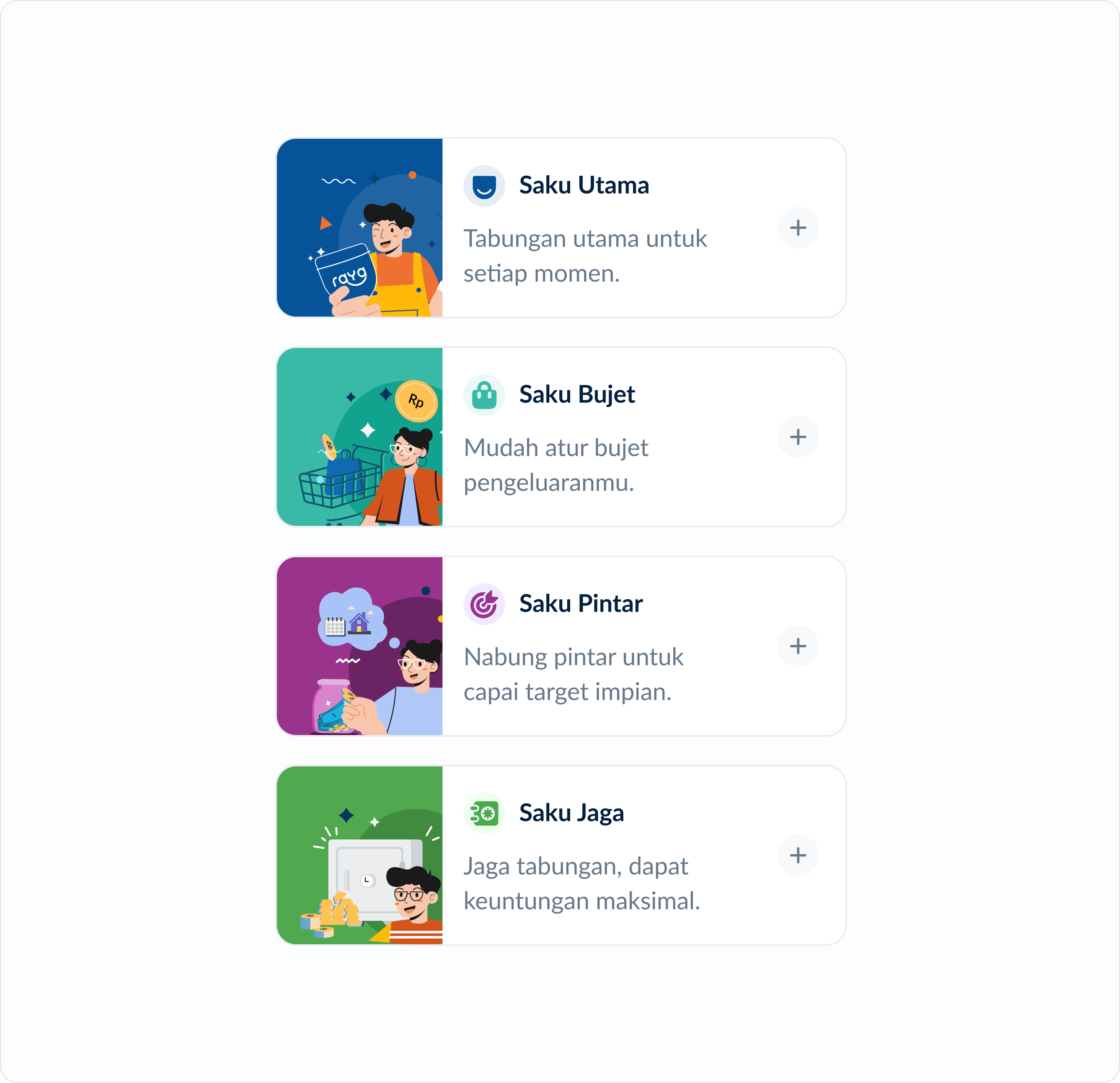
Users couldn't tell Saku types apart. Some moved money back to the Saku Utama (default account) before every transaction, assuming it was the only one that worked.
Buried structure
Saku were buried under the heavy visuals. Managing Saku also became a hassle because access to each Saku was hidden in multiple steps and scroll.
CHECK INDIVIDUAL SAKU FLOW:


Scope down, launch fast
The company was focused on rapid growth, with limited engineering resources. The scope was capped to revamping existing pages without touching the underlying flows. Stakeholder push was inevitable, so to ensure the improvement live ASAP, we did the development in several phases. The final design had to be decided early even though the upcoming features backlog wasn't finalized yet. Every design decision had to account for features that didn't exist yet.
The company was focused on rapid growth, with limited engineering resources. To ensure the improvement live ASAP, we did the development in several phases. The final design had to be decided early even though the upcoming features backlog wasn't finalized yet.
Setting up the design direction
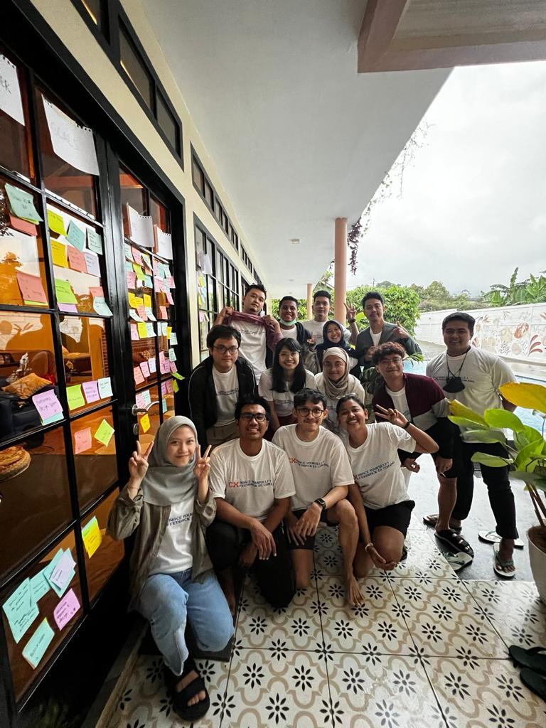
We involved internal teams early, from business to marketing, to align on shared goals. Each team had different needs:
We involved internal teams early to align on shared goals. Each team had different needs:
Business
Needed to push new user to be active, top-up & transacting more
Marketing
Wanted prominent campaign section for promos and content
Product
Aimed to build a delightful and personalized experience
Mapping these intentions helped us define a unified direction for the new home. We wanted to create a simple and easy to understand design with clear information to make users feel secure, while still bring out the fun and the festive spirit (Raya means ‘celebrate’ or a ‘feast’).
We wanted to create a simple and easy to understand design with clear information to make users feel secure, while still bring out the fun and the festive spirit (Raya means ‘celebrate’ or a ‘feast’).
What content will be displayed on the Home?
After we uncovered useful insight through benchmarking, content analysis, and user research, with future backlog in consideration, we gathered and brainstormed to create the content plan:
With future backlog in consideration, we gathered and brainstormed to create the content plan:
Notice the amount of content compared to the existing homepage was massive. We have to consider the length and keep the essentials above the fold.
Showcasing the Saku
The first thing we considered on
the homepage was displaying the Saku.
Should we shown the Saku at Home?
Will that
be easier for users to use and manage?
I did several explorations for the hero section, and we narrowed it down to three
directions.
Can you guess which one is our pick?
I did several explorations for the hero section, and we narrowed it down to three directions.
Can you guess which one is our pick?
Nice guess! You’re absolutely right.
Why we chose Clickable Overview
It provide the simplest view
that worked for everyone, with entry point to see more.
The overview provide
straightforward list of all Saku and better scalability.
The compact card length
give more space for other content above the fold (including menu and promo section)
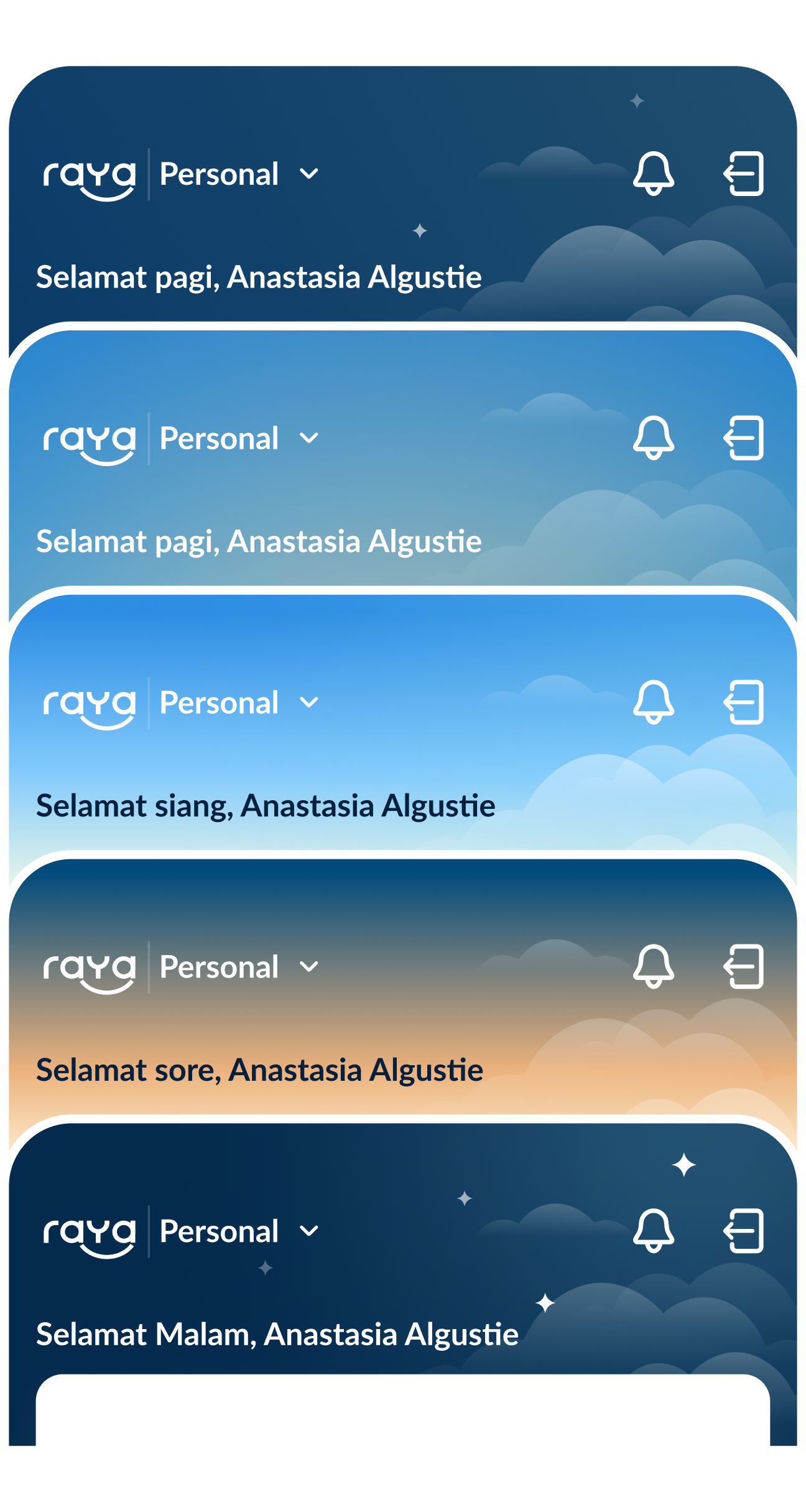
and provide a background space for personalized header.
Not quite. We went with Clickable Overview.
Why we didn’t pick Carousel Display
It produced more visual
complexity with more Saku on display.
The tight space restricts no more than two
Saku shown at a glance.
The layout also makes it difficult to add the greetings and
customized background for future events.
Not quite. We went with Clickable Overview.
Why we didn’t pick Expendable Favorite
The favorite scheme will add
more steps for users, which we avoid at the time.
The favorite saku on the list
will be limited due to lack of space.
The expanded state will push the other
content below the fold.
Hero card exploration
The hero card serves as the visual anchor for the user’s main account, allowing summary and quick access at a glance. Considering the numerous content to be added, we wanted to display feature-packed information while keeping it easy to digest.
Show hero card exploration

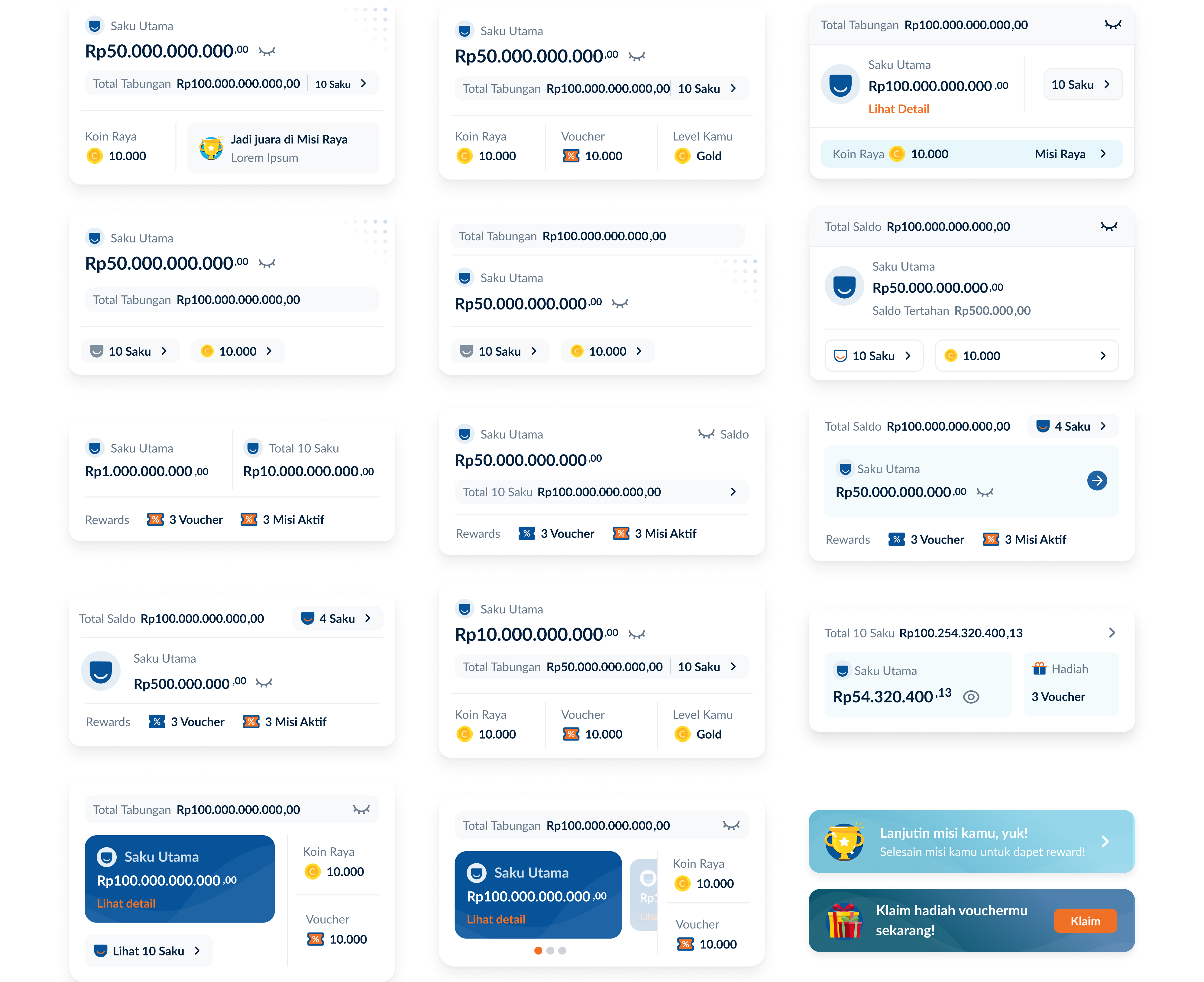
The final concept balanced information density with simplicity. Instead of trying to squeeze in the full feature list, we decided to reprioritize to keep it simple. Motion content switching part provide flexible slot for the future features.

Home evolution
From the existing experience to the final design of Bank Raya 2.0.
drag the handle to explore homepage states
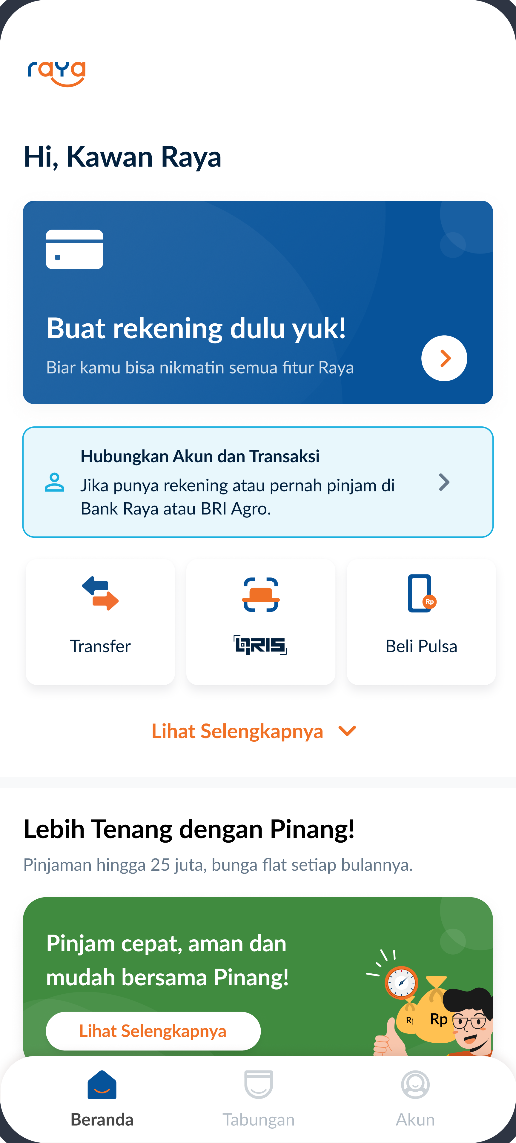
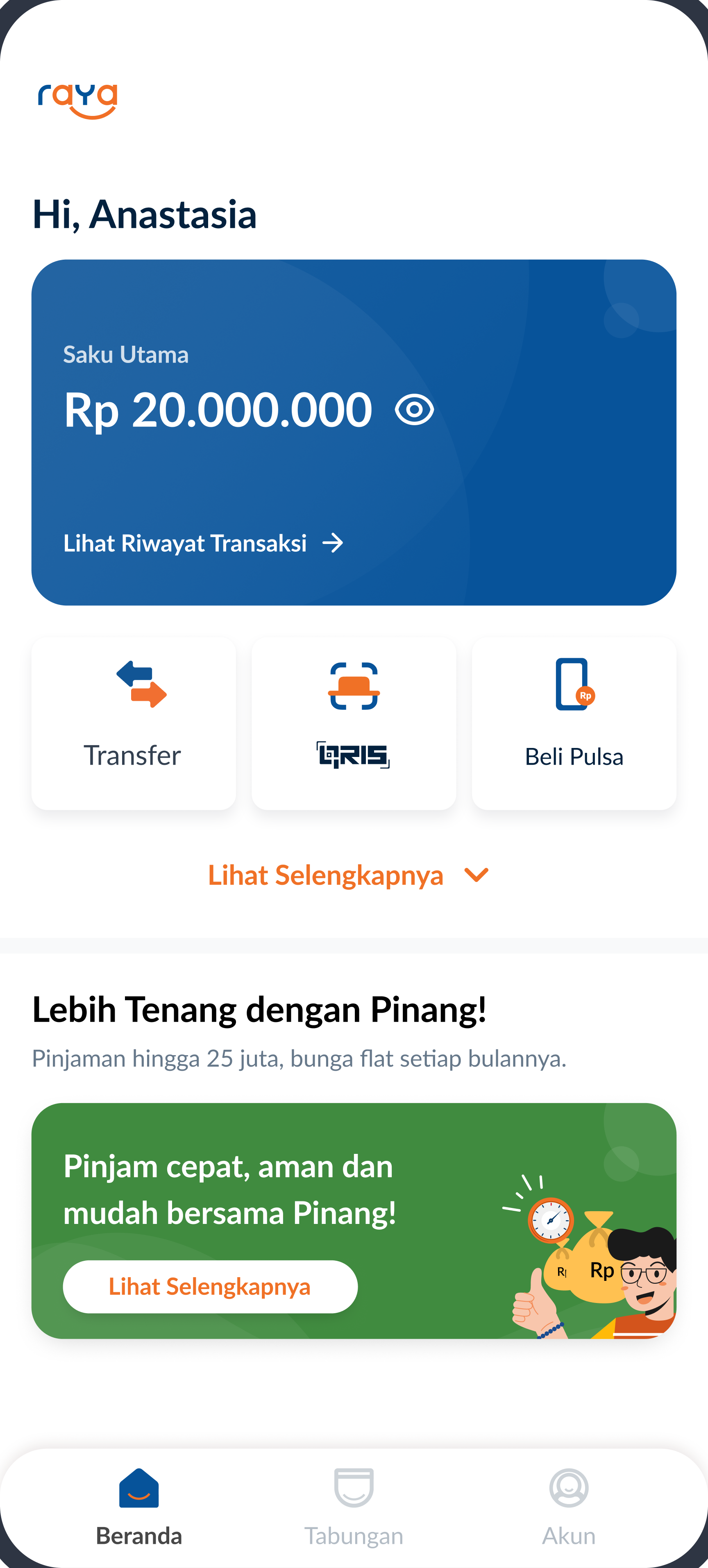
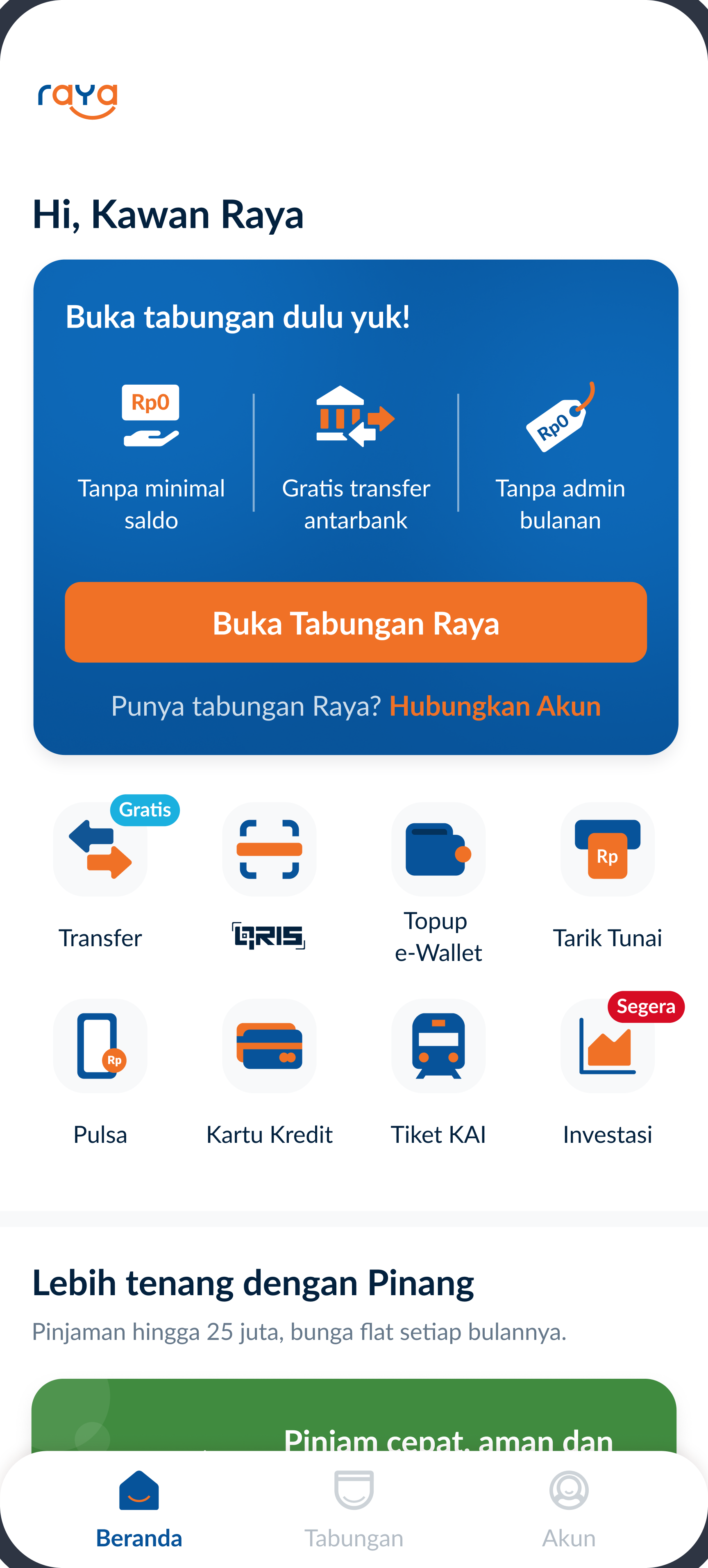
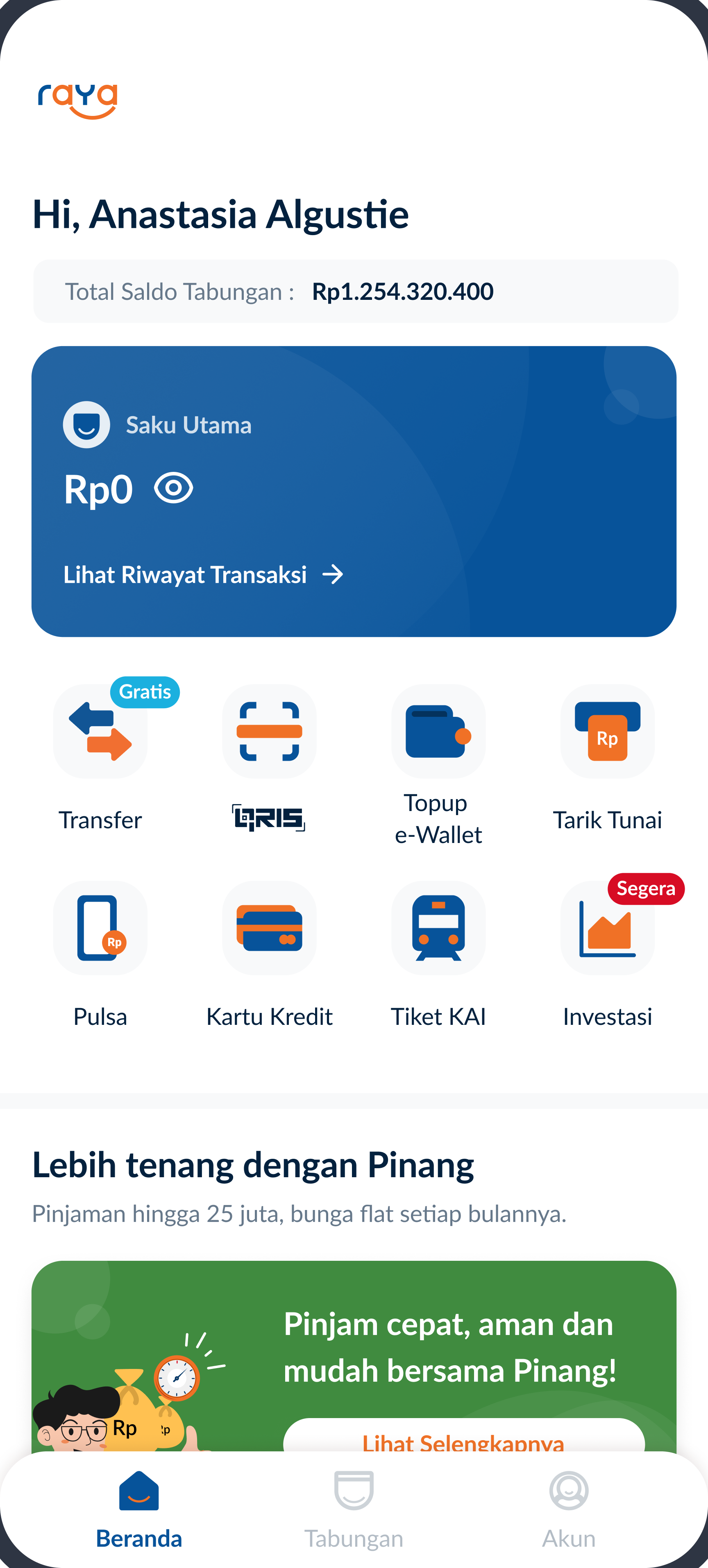
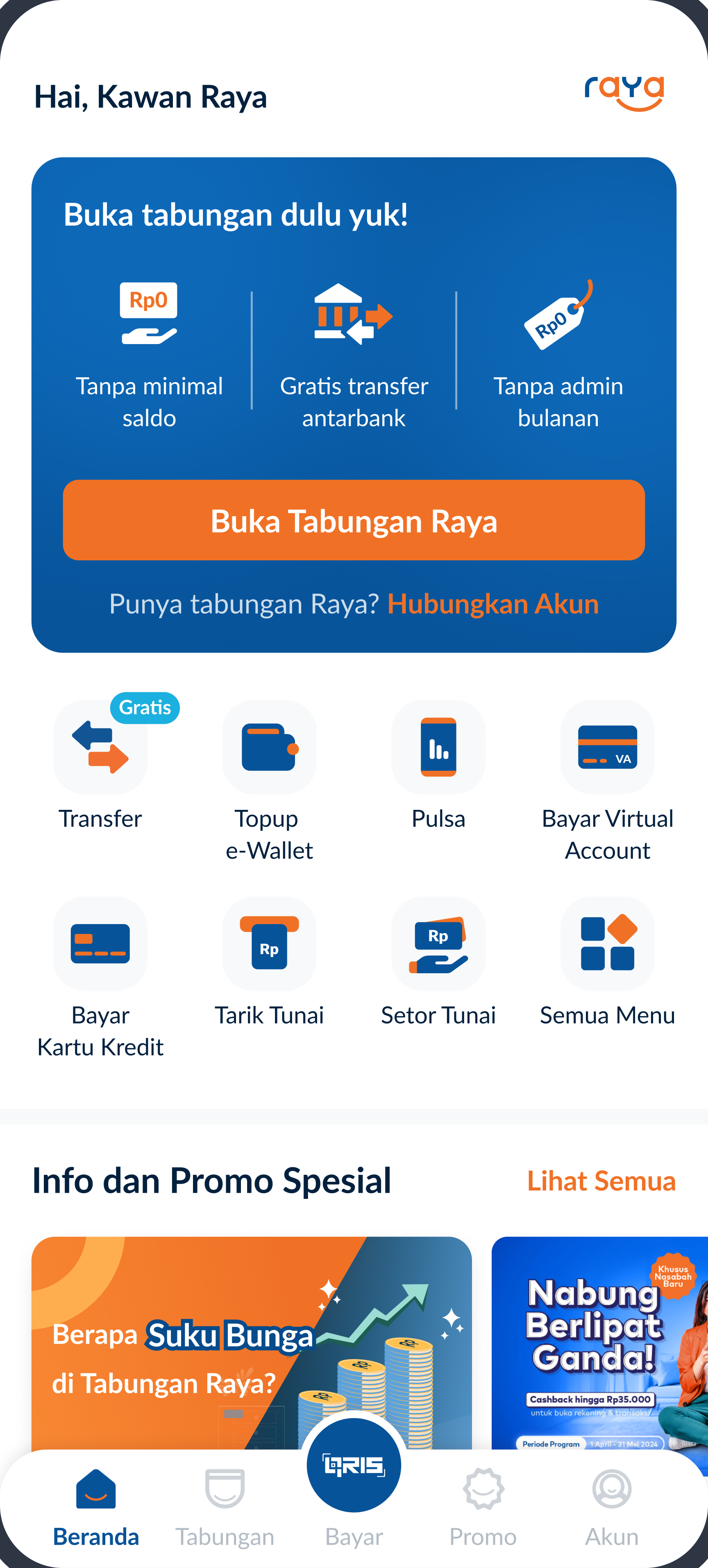
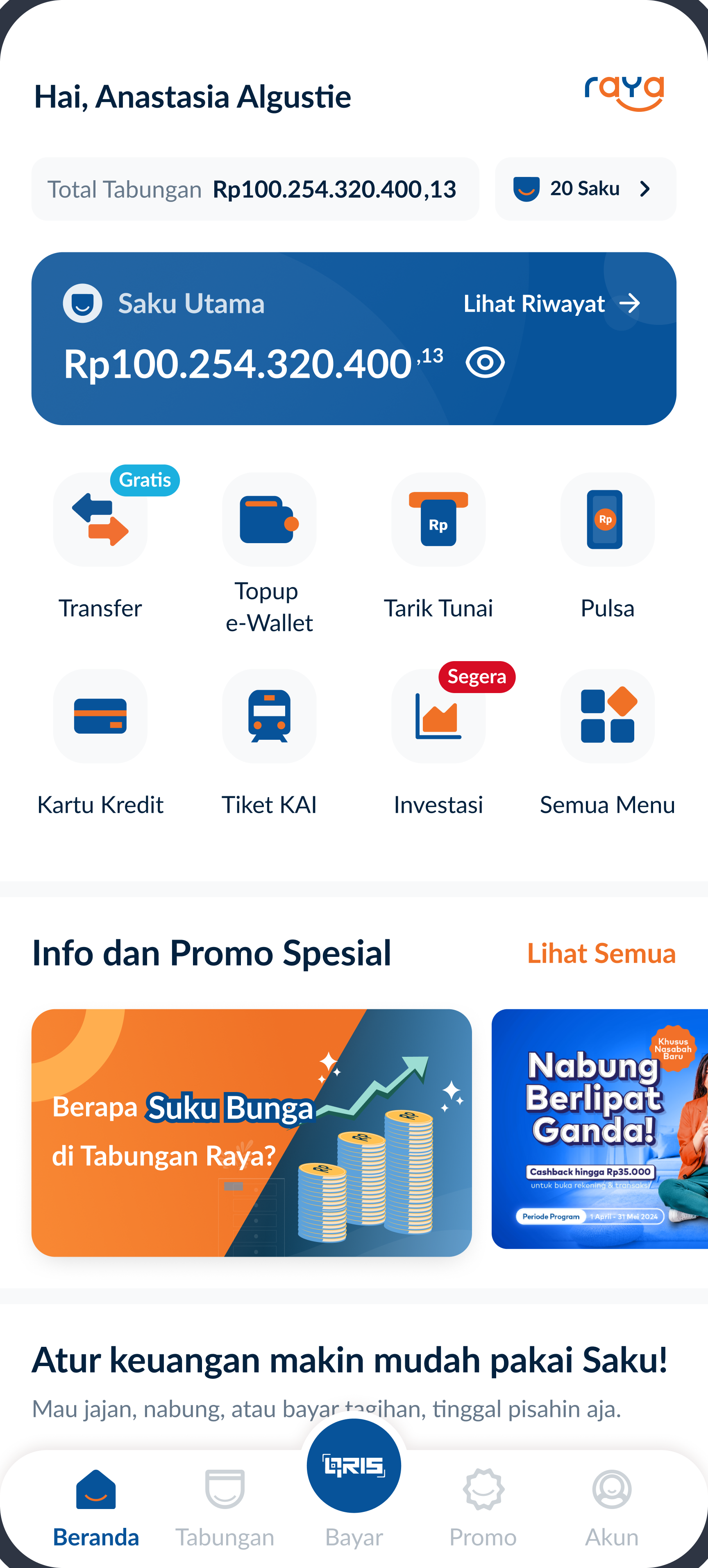
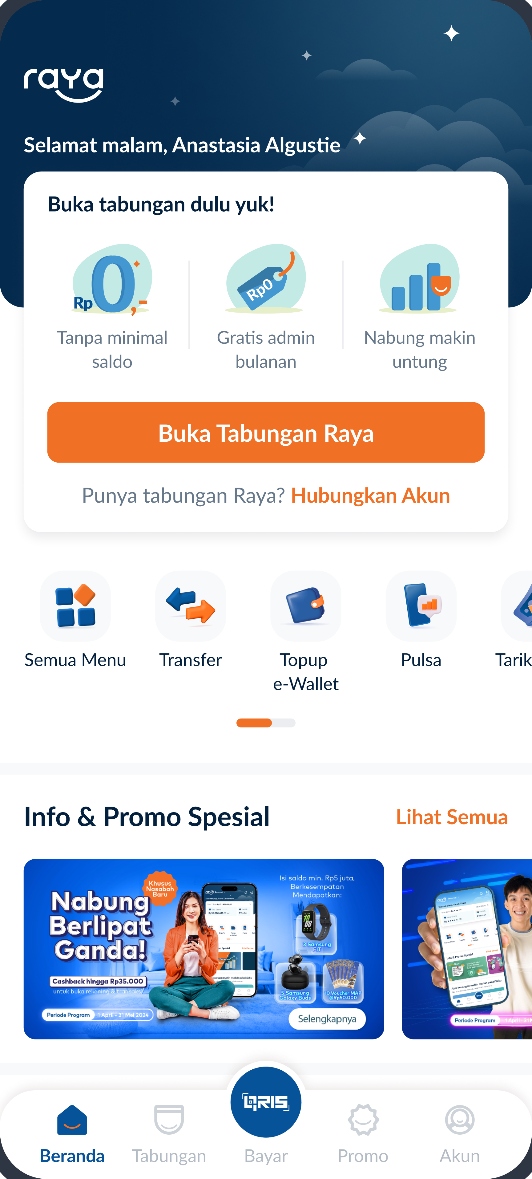
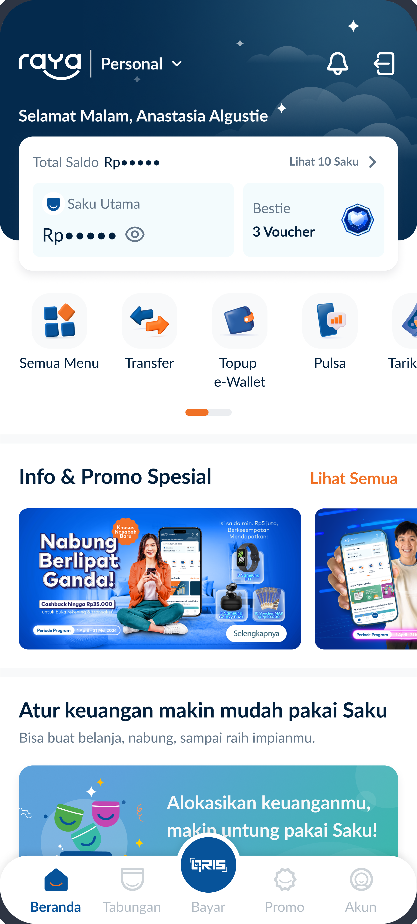
IMPACT
- 4 to 1 steps to overview Saku
- Total balance visible at glance
- Friendlier header
- More complete and clearer home
IMPACT
- 4 to 1 steps to overview Saku
- Total balance visible at glance
- Friendlier header
- More complete and clearer home
How might we encourage user to start exploring more?
Guiding new users with Minimum Viable Onboarding (MVO)
A first, we were considering an
onboarding walkthrough.
But after long registration process, wouldn’t it be
overwhelming?
So I reframed the design around users goals — why users using Bank Raya in the first place, and introduced the MVO to help users take their intentional first steps, without turning the experience into a forced tutorial.
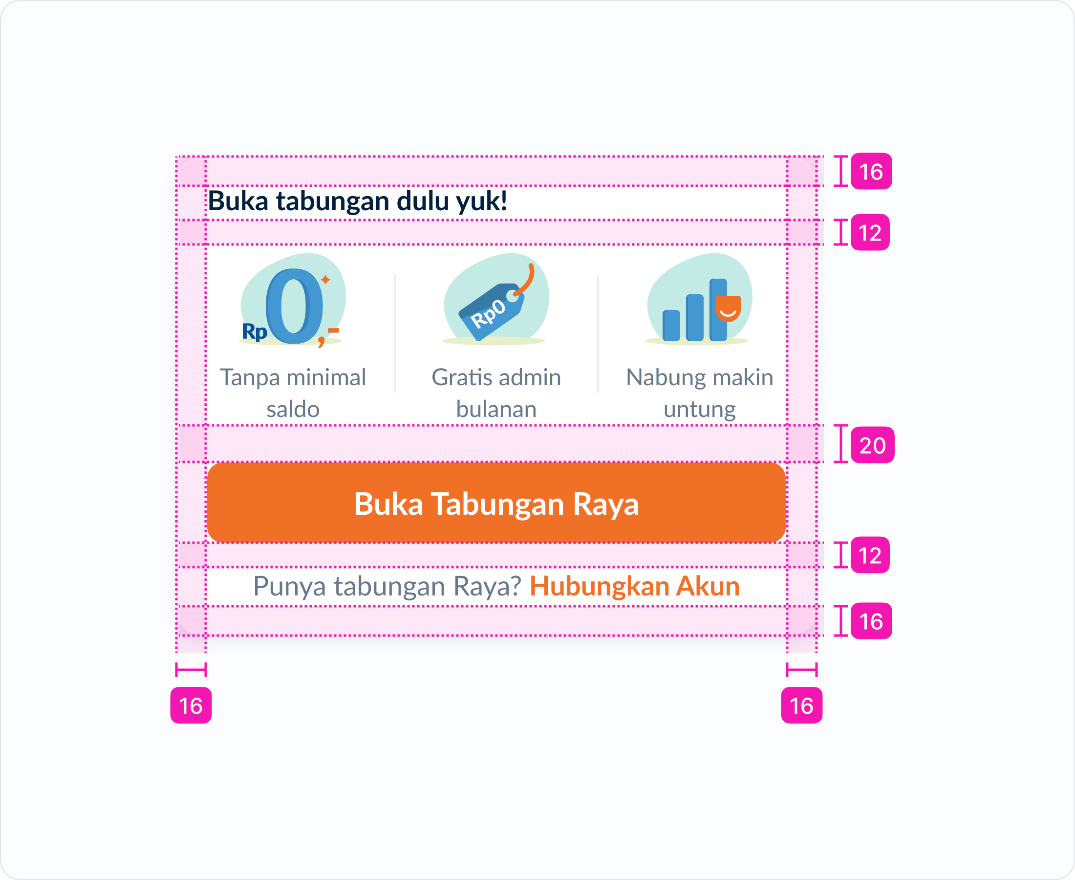
The MVO card embedded directly on the home screen as the main task for new users. Users can choose which action to start with, and the guidance for that specific step follows.
The starter pack covered the main jobs to be done and the minimum actions needed for a user to experience the core value of the product:
- Create account
- Create new Saku
- Top up balance
- Do a transaction
Scroll hints with Dynamic Floating Button
We found out that contents below the fold was rarely accessed because users assumed it was just ads. To address that, we set their expectation by giving hints through Floating Action Button. Tapping it will auto-scroll to the specific section. This helps users discover more features below and quickly scroll up when they hit the bottom.
Re-attract the returned users
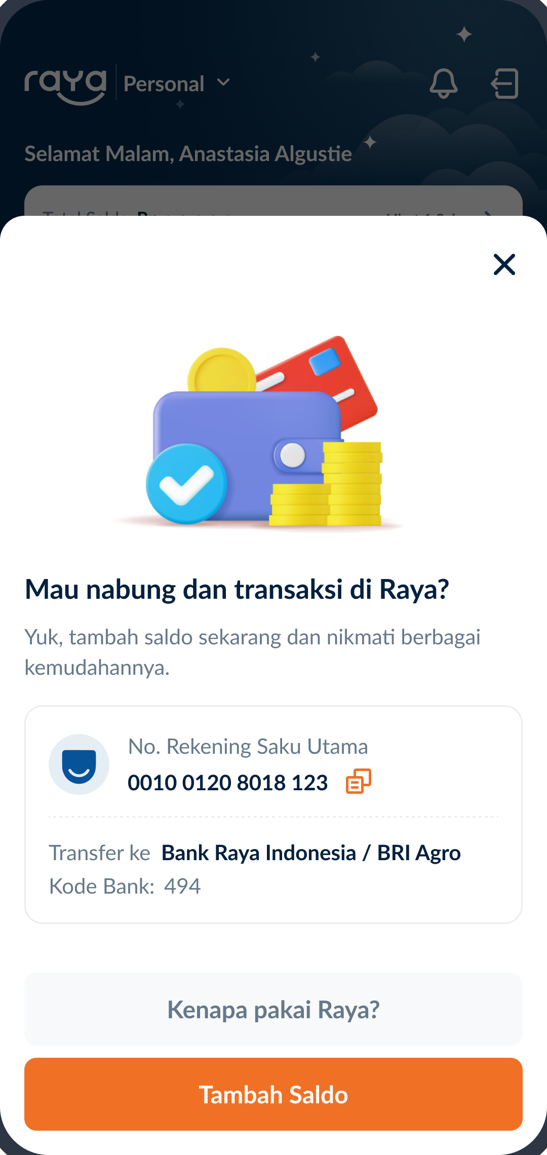
Zero balance / inactive users numbers were quite high. When they came back, we took the opportunity to re-board them, prompting them to top up and providing the story screen that reminds them what Bank Raya has to offer.
IMPACT
- around 25% Month on Month increase of top up conversion
- around 24% Month on Month increase of transaction conversion
- Increased apps engagement
- Reduced zero balance users
- Guidance for new users
How might we make users understand Saku?
Saku is Bank Raya’s highlighted feature which buried under its complexity. Users were hesitant to use it because they either failed to see its value or were simply unable to understand it.
What constitutes an easy-to-understand financial experience?
Our main focus was revamping the Saku card list page and the Saku info page, and this was the vision:
Our main focus was revamping the Saku card list page and the Saku info page, and this was the vision:
Visual
Clean UI.
Proper layouts.
Clear
illustrations.
Writing
Use plain language.
Give real
example.
Transparent rules.
Experience
Easy navigation.
Maintained
cognitive load.
Cutting the noise on Saku card list
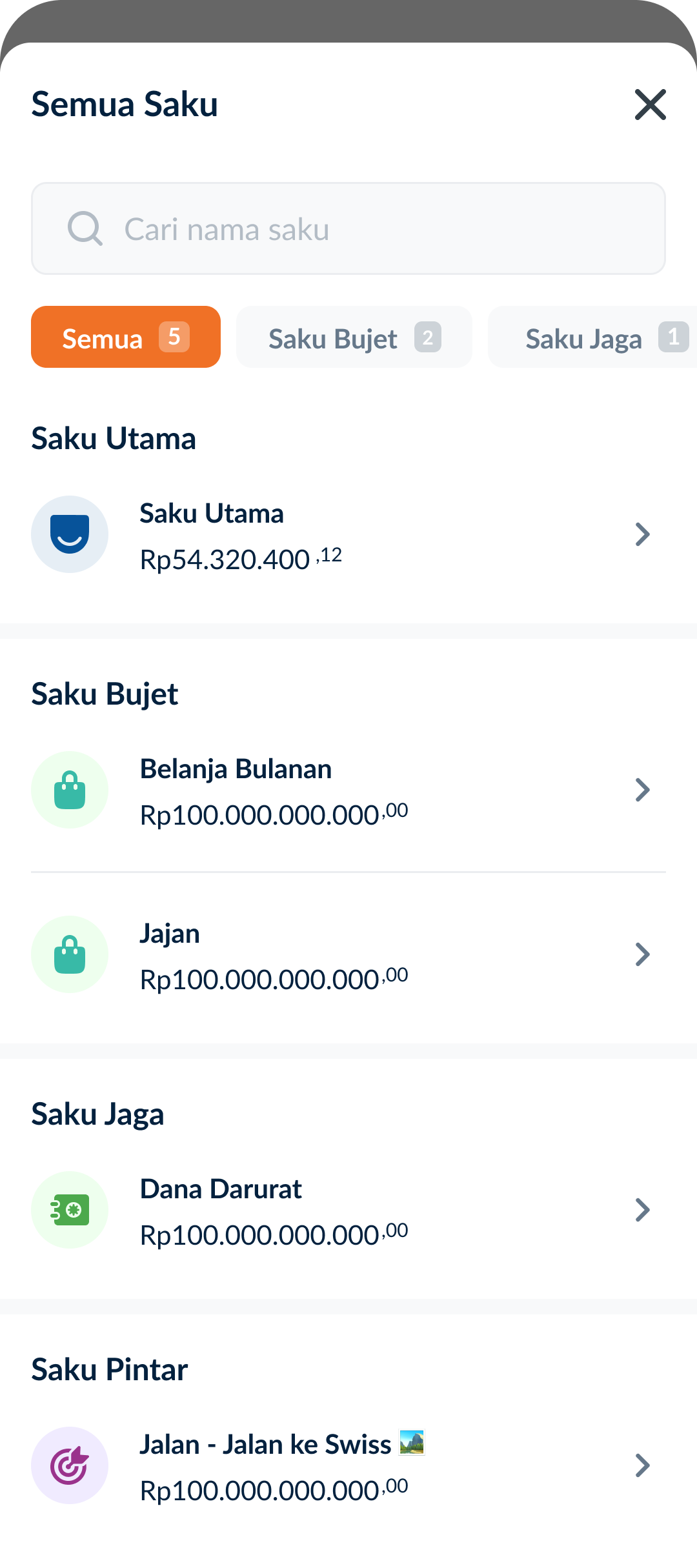
The previous Saku list was visually heavy. I adjusted the cards to be compact, so all basic Saku types are above the fold. Balance visibility now controlled from the sticky Total Saku card rather than managed card by card. Creating new saku also has quicker access through the sticky card.
Digestible Saku info page
Information about each Saku is quite overwhelming for users and they tend to skip long reads.
So why not make it fun and simple?
Exploration #1
The initial idea was to present the introduction as a simple comic strip, providing light info and use case examples before deep dive into each Saku’s detail.
We decided to drop the comic strip concept
The comic strip concept was much easier to digest than a wall of text, but the effort was too high for the timeline.
Exploration #2
Given the impact and development capability at the time, improving the existing info page was the more practical and scalable starting point.
Why the revamped info page works
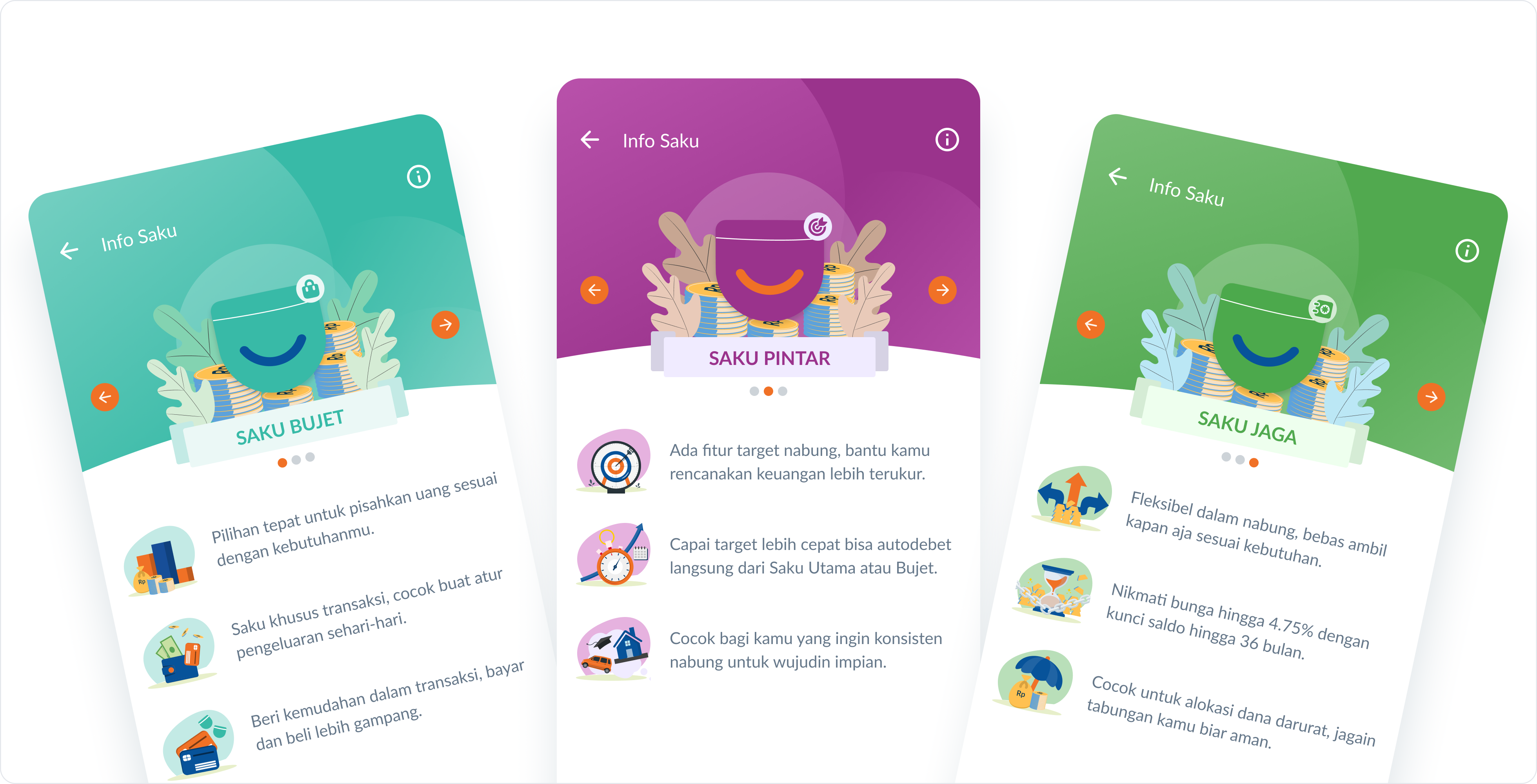
Adding illustrations help users digest the information. The copy was rewritten around real use cases and guide users to understand what it is suitable for. A quota indicator subtly hinted the multiple Saku option. Each description also subtly ties the Saku name to its purpose, making it easier to remember.
Suggested saku purpose
To help users get started, we added a few recommendations for the Saku name upon creation by gathering the most common ones. This helps new users draw inspiration for how they can separate their savings.
IMPACT
- Increased saku creation
- Improved saku understanding
- Faster saku creation
Total impact
So far the early monitoring after the revamped design and MVO was introduced showed positive movement:
- 4 to 1 steps to overview Saku
- Total balance visible at glance
- Friendlier header
- More complete and clearer home
- around 25% Month on Month increase of top up conversion
- around 24% Month on Month increase of transaction conversion
- Increased apps engagement
- Reduced zero balance users
- Guidance for new users
- Increased saku creation
- Improved saku understanding
- Faster saku creation
I departed shortly after the final Home & Saku went live. However, I continued to seek updates on how the design performed after launch.
The MVO was later replicated for
Raya Business.
Bank Raya was awarded at the IDX Channel Anugerah Inovasi Indonesia 2025
for:
Best Financial Sector Award in Product and Business Model with Innovation: Raya Apps Digital Ecosystem for Financial Literacy
Nothing great is achieved alone :)
These all wouldn’t be possible without the great works of:
Partner in research — Atrasina Winona (UX Researcher) Design reviewer — Komang Adelia (Head of Design), Farhad Idris (VP of Product & CX) PM & PO — Soni, Vincent, Monic. Design peers & Development team, and many others which I couldn’t name one by one.